
Kagi Charts: Reversal Amount, Shoulders and Signals


Contents
- Kagi charts in 30 seconds
- What is a Kagi chart?
- How a Kagi chart is built
- Choosing the reversal amount
- Kagi, Renko or point and figure?
- How to read Kagi signals
- Pros and cons of Kagi charts
- Where to get Kagi charts
- Conclusion: who should use Kagi charts
- Frequently asked questions about Kagi charts
- About the author
The Kagi chart is the quietest of the charts without a time axis. It draws a single unbroken line that changes direction only when price turns against the current move by a fixed amount. Its real signal, though, is not the direction of the line but its thickness.
That is what sets it apart from Renko and point and figure. Measured on Germany’s DAX stock index (the Yahoo Finance cash index series, all amounts in index points) with a reversal amount of 100 points, the Kagi line turned eight times but changed its signal only four times. It shows a lot of movement and asks for little action. On this page I explain how the chart is built, how to choose the reversal amount and, in a direct comparison, when each of the three timeless chart types is the right one. This article follows our editorial policy.
Kagi charts in 30 seconds
- No time axis: the line moves only when price moves. When the market stands still, nothing happens on the chart.
- Reversal amount: the line turns only when price moves against the current direction by the set amount. Anything smaller is ignored.
- Shoulder and waist: a peak of the line is called a shoulder, a trough a waist. They are the reference points for every signal.
- Yang and yin: when the line breaks above the last shoulder it turns thick (yang, often green). When it falls below the last waist it turns thin (yin, often red). This change is the signal, not the direction.
- Few signals: in the DAX example on this page, eight reversals produced only four signal changes.
- Origin: the chart was developed in Japan in the late 19th century, in the same tradition of Japanese charting that gave us candlesticks.
What is a Kagi chart?
A Kagi chart is a price chart without a time axis that draws the price path as one continuous line of vertical and horizontal sections. The line changes direction only when price turns against the current move by a set reversal amount. Its thickness shows whether the last break was above a high or below a low.
The method is Japanese and dates back to the late 19th century. StockCharts’ ChartSchool, citing Steve Nison, places its invention in Japan in that period. Nison introduced Kagi charts to Western traders in his book Beyond Candlesticks, so they belong to the same family as candlestick charts. The exact meaning of the name is told in different ways, so I leave it at the fact that it is a Japanese word.
The practical difference to a line chart is the filter. A line chart connects the closing prices and twitches with every move. The Kagi chart ignores everything that stays below the reversal amount and only draws on when a real countermove happens. If you want the basics of reading a normal chart first, start with how to read candlestick charts.
How a Kagi chart is built
Two rules decide everything on a Kagi chart. The first one controls the movement of the line, the second one its thickness.
Shoulders and waists
As long as price keeps going in the current direction, the vertical line gets longer. When it turns by at least the reversal amount, a short horizontal section appears and the line continues in the other direction. A turning point stays behind at that spot.
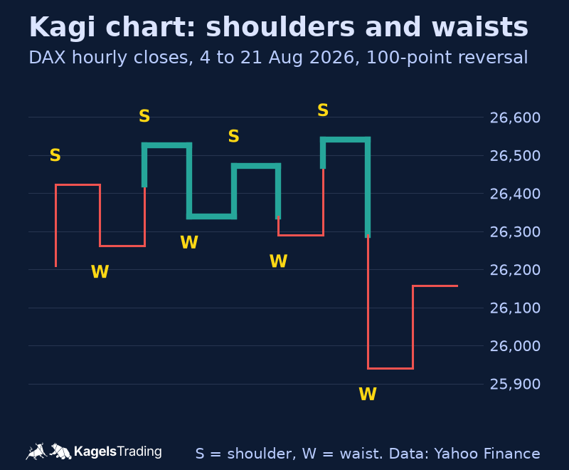
These turning points have their own names: a peak is a shoulder, a trough is a waist. They are not decoration. They are the reference points at which every Kagi signal is decided. The chart shows them on the DAX with a reversal amount of 100 points.
 Click to enlarge
Yang line and yin line
Here is the feature that makes the Kagi chart different from every other chart type. When the line rises above the last shoulder, it becomes thick. That is the yang line. When it falls below the last waist, it becomes thin. That is the yin line. Most platforms add color: green for yang and red for yin is a common default.
The line can therefore rise and still stay thin, as long as it does not pass the last shoulder. That is the filter: there are many changes of direction and few changes of signal. In the chart above, eight reversals stand against four switches between yang and yin. Each switch happens exactly at the broken shoulder or waist, which is why a single vertical line can be thin at the bottom and thick at the top.
Choosing the reversal amount
The reversal amount is the main setting of a Kagi chart. It works like the box size in point and figure or the brick size in Renko and decides how large a countermove must be before the line turns. The data interval behind the chart and the choice of closes or highs and lows also change the result, so keep them fixed when you compare settings.
There are three common ways to set it. A fixed amount in points, pips or cents, a percentage of the price, or the ATR as a value that adapts to volatility. The ATR has the advantage that the threshold narrows in calm phases and widens in hectic ones. How the ATR itself is calculated is explained in the guide on the ATR indicator.
 Click to enlarge
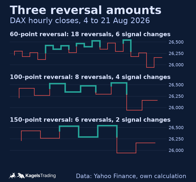
The effect is clear in the numbers. With a reversal amount of 60 points the DAX line turned 18 times in the sample period, with 100 points 8 times and with 150 points only 6 times. The signal changes fell from 6 to 4 to 2. If you choose the amount too small, you get a restless chart and lose the advantage of the method. If you choose it too large, you see a reversal only when a good part of the move is already over.
A rule of thumb that has worked for me: set the reversal amount in the range of your own stop distance. Then the sensitivity of the chart matches the risk you carry on each trade anyway. More on stop distances that follow volatility is in the guide on the volatility stop-loss.
Kagi, Renko or point and figure?
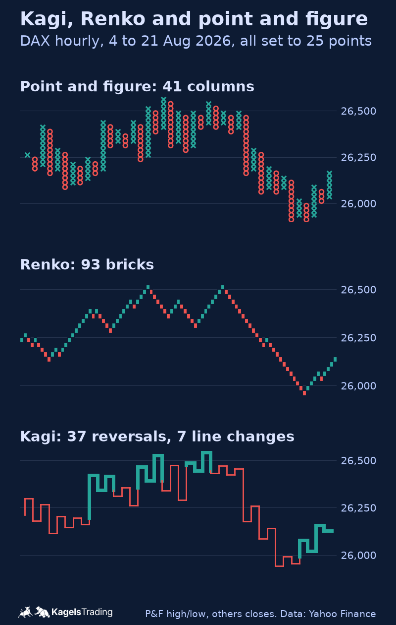
All three charts work without a time axis, and all three filter market noise. Still, they are not interchangeable. The chart shows the same DAX data in all three forms, each with the same value of 25 points.
 Click to enlarge
The numbers show how differently the three treat the same input. Renko draws by far the most elements, because every full brick gets its own column. Point and figure stacks boxes in one column as long as the direction holds and needs three boxes for a reversal. Kagi sits close to point and figure in the count, but it shows the state of the trend directly in the line thickness.
| Chart type | Reversal | Elements in the example |
|---|---|---|
| Point and figure | Free to choose, usually 3 boxes | 41 columns |
| Renko | Fixed by design: 2 bricks | 93 bricks |
| Kagi | Free to choose via the amount | 38 vertical lines (37 reversals) |
DAX, 120 hourly bars from August 4 to 21, 2026, all three with a value of 25 points. Point and figure uses highs and lows, Renko and Kagi use closes.
This leads to a practical split. The Renko chart suits you if you want to see the trend as a staircase. The point and figure chart is strong at support and resistance and at measuring price targets. The Kagi chart plays its strength when the question is whether a trend is still intact, without treating every countermove as a signal.
How to read Kagi signals
The basic signal logic is short: two rules and one important consequence. It makes the chart interesting for trend followers. Traders who want to catch reversals early will find the basic signals late, although StockCharts describes further Kagi patterns for that purpose.
- Buy signal: the line rises above the last shoulder and changes from thin to thick. Only this change counts, not the upward move itself.
- Sell signal: the line falls below the last waist and changes from thick to thin.
- No signal: an upward move that stays below the last shoulder changes nothing. The line stays thin, even though price is rising.
The third rule is the most important one, and it is where most traders go wrong. If you buy on the first upward section, you have missed the principle: the thickness changes only when a previous extreme has been broken.
In practice, rising shoulders point to an intact uptrend and falling waists to a downtrend. If both stay at a similar height, the market is moving sideways, and the signals often alternate at short intervals. That is the situation in which the basic Kagi signals tend to cost the most money. How I handle such phases on a normal chart is shown in the guide on range trading.
Pros and cons of Kagi charts
Like every filter, the Kagi chart gains in one place what it loses in another. The two lists sum up what that means in practice for a trend follower.
Pros of Kagi charts
- Shows trend state in the line itself: the thickness tells you at a glance whether the last break was up or down, separately from the direction of the line. In the example, eight reversals stood against four line changes.
- Trend strength at a glance: rising shoulders and rising waists show an intact uptrend without drawing a single trendline.
- Very calm picture: one continuous line without gaps is quicker to take in than columns or bricks, especially over longer periods.
- One main setting: the reversal amount does most of the filtering. The data interval and the price field matter too, but they rarely need changing once chosen.
Cons of Kagi charts
- Late signals: the thickness changes only after a previous extreme has been broken. By then part of the move is over, often more than on a Renko chart.
- Weak in sideways markets: if shoulders and waists sit at a similar height, the line can switch back and forth quickly. Following every switch can lead to repeated whipsaws and trading costs.
- No OHLC data, filtered endpoint: like Renko and point and figure, the chart does not show the open, high, low and close of a period, and the end of the line can differ from the current market price. Check the live quote or a normal price chart before you place an order.
- Not widely used: there is little literature and few traders to discuss the method with. If you start with it, you mostly work on your own.
Where to get Kagi charts
Kagi is the rarest of the three timeless chart types and built into fewer platforms than Renko. These four offer it as a standard chart type (checked November 12, 2026).
- TradingView: Kagi is in the chart type menu. According to the TradingView help center, the line size can be set with the ATR (default length 14), as a fixed traditional value or as a percentage of the last price, which can repaint. More in my TradingView review.
- StockCharts.com: in SharpCharts, choose Kagi as the chart type under the chart attributes. The reversal can be set in points, as a percentage or with the ATR, and the price field can be the close or the high-low range. More in the StockCharts review.
- NinjaTrader: Kagi is a built-in bar type. The reversal is set in ticks or as a percentage, and the default colors switch from red to green once the last high is exceeded (NinjaTrader 8 help guide).
- TradeStation: the TradeStation help describes a Kagi chart with a reversal as a fixed price or a percentage.
MetaTrader is the notable gap. Neither MT4 nor MT5 offers Kagi as a standard chart type. There are indicators in the MQL5 market, but their quality varies a lot.
One setting is often overlooked: which prices the chart is built from. TradingView builds Kagi from closing prices, and that is also the usual default elsewhere. StockCharts lets you switch to the high-low range. That variant produces more reversals and earlier signal changes. Both are valid, as long as you stick to one of them.
Conclusion: who should use Kagi charts
The Kagi chart answers one single question, but it answers it very cleanly: is the trend still intact? As long as the line stays thick, the market has not broken a previous low. Everything else that happens in between is filtered out. For a trend follower that is exactly the right reduction.
That makes it a second opinion, not a rival to the candlestick chart. This is how I use this family of charts myself: the candlestick chart decides the entry, the timeless chart decides whether I look for trades in the direction of the trend at all. For the entry I use the normal chart, because the end of the Kagi line is a filtered value and can differ from the current price.
If you want to try it, start with a reversal amount close to your own stop distance and run the chart for two weeks next to your usual one. If the signal changes keep coming too late, that is not a flaw of the method. It means your own trading horizon is shorter than the one this chart was built for. Then the candlestick chart is the better choice.
Charts and numbers on this page are market analysis and education, not investment advice. The DAX example is one historical period and does not prove that Kagi signals will work in the future.
Frequently asked questions about Kagi charts
What is a Kagi chart?
A Kagi chart is a price chart without a time axis. It draws the price path as one continuous line of vertical and horizontal sections. The direction changes only when price turns against the current move by the set reversal amount.
Where do Kagi charts come from?
Kagi charts were developed in Japan in the late 19th century. Steve Nison introduced them to Western traders in his book Beyond Candlesticks. The exact meaning of the Japanese name is explained in different ways by different sources.
What do thick and thin lines mean on a Kagi chart?
The thick line is called the yang line and appears as soon as price rises above the last shoulder. The thin line is the yin line and appears as soon as price falls below the last waist. This switch is the actual signal, not the direction of the line.
What are shoulders and waists?
A peak of the Kagi line is called a shoulder, a trough a waist. Every signal is decided at these two points: breaking a shoulder makes the line thick, breaking a waist makes it thin.
How do I choose the reversal amount?
A fixed amount, a percentage of the price or the ATR are the usual choices. As a rule of thumb, a value close to your own stop distance has worked well. In the DAX example on this page, a 60-point amount produced 18 reversals, a 150-point amount only 6.
What is the difference between Kagi and Renko charts?
Both work without a time axis, but they are built differently. A Renko chart sets bricks of equal size diagonally and needs two brick heights for a reversal. A Kagi chart draws one continuous line with a freely chosen amount and shows the trend state through its thickness. On the same DAX data there were 93 Renko bricks against 37 Kagi reversals.
Which trading style suits Kagi charts?
It suits trend-following approaches best, for example with holding periods of several days. In sideways phases the line can switch back and forth at short intervals, and many of these switches turn out to be whipsaws. For short-term entries I use it only next to a normal price chart.
This article is translated from the German edition on kagels-trading.de.
More Chart Techniques guides
- Draw key levels
Support and Resistance: How to Draw and Use Key Levels
Where useful levels come from, how to draw zones with a stated rule and how to turn a level into a trade plan.
- Read price action
Price Action Trading: How to Read Charts Without Indicators
Market structure, key zones and three bar patterns, with a core setup and a real SPY example where the signal failed.
- Read candlestick charts
How to Read Candlestick Charts: Body, Wicks and Context
Open, high, low and close in one candle, body and wicks, two real Gold candles read step by step and how often patterns really occur.
- Know candlestick patterns
Candlestick Patterns: 10 to Know, Tested on Real Data
Ten patterns with rules and a cheat sheet, counted on DAX, S&P 500, EUR/USD and Gold since 2014: most are rare, none is a signal on its own.
- Trade the hammer candle
Hammer Candlestick: Spot It, Trade It, Know Its Limits
Three features, the difference to inverted hammer and hanging man, entry and stop, and how rarely the hammer appeared in four markets since 2014.
- Spot a morning star
Morning Star Candlestick: Rules, Real Cases, Limits
Three measurable rules, every morning and evening star in four markets since 2014, and two real cases: one reached its target, one hit its stop.
- Spot a topping tail
Topping Tail Candlestick: Rules, Silver Example and Limits
Six measurable rules for the bearish rejection candle, a silver candle from January 2026 checked step by step, the difference from the shooting star and how to trade it with a stop.
- Combine timeframes
Multi-Timeframe Analysis: A Weekly and Daily Workflow
How to combine the weekly chart for context and the daily chart for entry under one stated rule, with a documented SPY case from June 2025.
- Trade pullbacks
Pullback Trading: Entries, Stops and Failed Setups
Pullback or reversal, limit against confirmation entry, and one fixed rule set on three real QQQ cases: a target, a stop and a cancelled setup.
- Trade sideways ranges
Range Trading: Boundaries, Orders and Two Documented Fades
A 14-session rule to draw horizontal boundaries, three order-type variants and two Alpaca-verified SPY fades, one that reached the target and one that was stopped out.
- Read a consolidation
Consolidation in Trading: What the Range Tells You
What a consolidation is, why 25 years of index data showed no stable direction edge from narrow ranges or the prior trend, and two DAX breakouts from 2026.
- Read chart formations
Chart Patterns: Reversals, Continuations and Failures
Reversal, continuation and bilateral formations with the measured-move convention per pattern and two documented SPY rectangle cases.
- Trade rising and falling wedges
Rising and Falling Wedge Patterns: How to Trade Them
How to spot both wedges, where to set entry, stop and target, and why Bulkowski ranks the rising wedge with a downward breakout last of 36 patterns.
- Trade breakouts
Breakout Trading Strategy: Entries and False Breakouts
How often breakouts fell back into the range in our count of 1,472, and how to plan entry, stop and position size.
- Draw and trade trendlines
Trendline Trading: How to Draw Trendlines and Trade Them
How to draw trendlines with a fixed rule, four strategies for bounces, breaks and retests, and a real SPY line break without a lasting reversal.
- Draw a pitchfork channel
Andrews Pitchfork: How to Draw It, Trade It and Test It
Three pivots, a median line and two parallels, Schiff variants, a trade plan and how often price reached the median line in 746 cases.
- Use Fibonacci levels
Fibonacci Retracement Levels: How to Draw and Trade Them
How to calculate and draw retracement levels, trade pullbacks with confluence and a stop at the structure, and what a ten-year test says about the levels.
- Set Fibonacci targets
Fibonacci Extension: Levels, How to Draw It and Calculator
Three-point extension targets from the end of a pullback, why they differ from levels beyond 100%, a free calculator and three SPY swings, one without a single target reached.
- Trade gaps
Gap Trading Strategy: How to Trade Gaps and When Gaps Fill
Opening and full gaps, the four classic gap types, how often SPY gaps filled in our count since 2001, and plans for gap fill and gap and go.
- Calculate pivot points
Pivot Points: Formulas, Types and How to Trade Them
Formulas for standard, Fibonacci, Woodie, Camarilla and DeMark pivots, a free calculator, which session counts and a real SPY day.
- Swing trade
Swing Trading: 4 Strategies, Risk and Real Examples
Four swing trading strategies on the daily chart, position size, gap risk and US rules, with two hypothetical SPY pullbacks: one hit its target, one was stopped out.
- Identify market stages
Stage Analysis: Stan Weinstein's Four Market Stages
Stan Weinstein's four stages on the weekly chart, a Stage 2 checklist and two TSMC breakouts: one ran for a year, one gapped through its stop.
- Screen for growth leaders
CAN SLIM: William O’Neil’s Seven Rules for Growth Stocks
William O'Neil's seven CAN SLIM criteria with thresholds, his selling rules, a free screen with real counts and what the tests really show.
- Read Wyckoff ranges
Wyckoff Method: Accumulation, Distribution and Springs
Accumulation and distribution with phases A to E, springs and upthrusts as optional tests, and two real TSMC ranges read with and without hindsight.
- Trade Darvas boxes
Darvas Box Strategy: Rules, Entries and Stop Losses
The box rules step by step, when the edges become known, where the stop goes, and a mechanical test on TSMC in 2024 with two honest results.
- Count Elliott waves
Elliott Wave Theory: Rules, Patterns and Fibonacci
The five-wave pattern, three hard rules, zigzags, flats and triangles, Fibonacci ratios and a real DAX count, from the first German translator of the standard work.
- Understand Smart Money Concepts
Smart Money Concepts (SMC): What They Are and What Holds Up
The seven SMC building blocks, BOS vs CHoCH vs MSS, one labeled SPY sequence that held, one that failed, and what a chart can and cannot show.
- Understand ICT trading
ICT Trading: Silver Bullet, Killzones and What Holds Up
Michael Huddleston's Inner Circle Trader method: Silver Bullet, Judas Swing, the 2022 model and killzones in New York time, with one SPY setup that worked and one that failed.
- Trade order blocks
Order Blocks: How to Spot, Draw and Trade the Zone
The three conditions behind a valid order block, entry and stop at the zone, two SPY cases from 2026 and a 25-year count where a fixed rule lost money.
- Trade fair value gaps
Fair Value Gap (FVG): How to Spot, Trade and Test It
The three-candle rule, bullish, bearish and inverse FVG, two SPY cases from 2026 and a 25-year count of how often gaps were revisited and traded.
- Trade inverse fair value gaps
Inverse Fair Value Gap (IFVG): Rules, Examples and a Test
When a broken gap counts as inverted, three entry styles, one SPY retest that held, one that failed, and a 25-year test with trend and sweep filters.
- Trade failed breakouts with Turtle Soup
Turtle Soup Trading: Raschke Rules, ICT Version and a Test
Linda Raschke's original rules, Turtle Soup Plus One and the ICT version side by side, two SPY examples and a 25-year test on SPY and QQQ.
- Read a break of structure
Break of Structure (BOS): Rules, CHoCH vs MSS and a Test
Which swing counts, BOS vs CHoCH vs MSS under one stated convention, two SPY breaks that won and lost, and a 25-year test against ordinary days.
- Read a change of character
Change of Character (CHoCH): Rules, BOS vs MSS and Data
The first close against the trend, close versus wick, CHoCH vs BOS vs MSS, two SPY cases and what the trend did next after 287 CHoCHs on SPY and QQQ.
- Read a market structure shift
Market Structure Shift (MSS): Rules, BOS vs CHoCH and Data
MSS as a CHoCH with a sweep and a fair value gap, the comparison with BOS and CHoCH, two 2021 cases and what 14 daily MSS on SPY and QQQ did next.
- Draw supply and demand zones
Supply and Demand Trading: Zones, Rules and Real Data
Base and departure rules, the four base patterns, how zones differ from order blocks and SMC, two SPY cases and a fixed test of 86 zone trades on SPY and QQQ.
- Read liquidity sweeps
Liquidity Sweep: How to Spot It and Trade the Reversal
Sweep or run, buy-side and sell-side liquidity, internal and external targets, SPY reversal, continuation and failed-reversal examples and a 25-year count of a fixed sweep rule.
- Spot bull and bear traps
Bull Trap vs Bear Trap: How to Spot a Trapped Market
What bull traps and bear traps are, the two signs of trapped traders, how to trade the reversal with a defined stop, and two real SPY examples from 2025.
- Interpret volume
Volume Analysis in Trading: How to Read Volume Honestly
What volume counts in stocks, futures, forex and crypto, how to read it against its own average, and our SPY test of high-volume days since 2001.