
Wyckoff Method: Accumulation, Distribution and Springs


Contents
- The Wyckoff method in 30 seconds
- What is the Wyckoff method?
- Richard D. Wyckoff: the man behind the method
- The Composite Man: a model of the market
- The three laws of the Wyckoff method
- The four phases of the price cycle
- Wyckoff accumulation: phases A to E
- Wyckoff distribution: phases A to E
- Example 1: TSMC’s distribution of 2021 and 2022
- Example 2: TSMC’s accumulation of 2022 and 2023
- Volume data: what Wyckoff needs and what you have
- Wyckoff’s five steps in practice
- Wyckoff, Stage Analysis and Smart Money Concepts
- Advantages and limits of the Wyckoff method
- My conclusion on the Wyckoff method
- Frequently asked questions about the Wyckoff method
- About the author
Every chart shows the result of buying and selling, but not who did it. The Wyckoff method tries to read the balance between supply and demand from price and volume, especially in the sideways ranges where a trend ends and the next one is prepared. Its best-known tools are the accumulation and distribution schematics with their phases A to E.
This guide explains the method from the basic idea to the two schematics, with two real TSMC ranges. You learn what the Composite Man is (a model, not a person), how the three laws work, how a spring and an upthrust are meant, and why the same week can look like a breakout at the time and like a trap a week later. At the end I explain how I use Wyckoff as a discretionary price action trader. This article follows our editorial policy.
The Wyckoff method in 30 seconds
- What it is: a way of reading price and volume together to judge whether supply or demand is in control.
- Three laws: supply and demand, cause and effect, effort and result.
- Four phases of the cycle: accumulation, markup, distribution, markdown.
- Two schematics: accumulation at a low and distribution at a high, each with phases A to E.
- Spring and UTAD: short false moves beyond the range. They are optional; many ranges have neither.
- Time frame: mainly daily and weekly charts, shorter ones only as a supplement.
- The catch: the labels are an interpretation, and many are only clear with hindsight.
What is the Wyckoff method?
The Wyckoff method is an approach to technical analysis, developed by Richard D. Wyckoff in the early 20th century, that reads price and volume to judge the balance of supply and demand and to find the turning points between trends and trading ranges.
At its core, the method is a way of thinking, not a signal system. It asks which side is in control: supply or demand. It pays most attention to trading ranges, because that is where a large position can change hands without moving the price too much. A range at a low may be accumulation, a range at a high may be distribution, and the job of the analyst is to tell them apart before the breakout.
What the chart shows and what it means are two different things. The chart shows price, volume and time. That institutions are buying or selling is an inference from that data, not something you can see. This guide keeps the two apart: the facts come from the chart, the intentions are a reading of it.
Richard D. Wyckoff: the man behind the method
Richard D. Wyckoff (1873 to 1934) started on Wall Street around 1888, at about 15, as a stock runner. In 1907 he founded The Ticker, which became The Magazine of Wall Street in 1911, and he wrote several books on trading, among them a memoir published by Harper & Brothers in 1930. In his magazine he also published interviews about the trading methods of Jesse Livermore, later collected in book form.
His lasting work is a course. In the 1930s Wyckoff turned his ideas into “The Richard D. Wyckoff Method of Trading and Investing in Stocks”, and the Stock Market Institute, which he founded in 1931, kept teaching it after his death. A scan of a 1937 printing of the course is available on archive.org, and we used it to check the terms in this guide.
Was Wyckoff a successful trader? He made his name as a writer, publisher and teacher. His own trading record is not documented independently, and reports from his time describe heavy losses in the early 1920s. Much of today’s vocabulary, including the phases A to E and terms such as spring and UTAD, comes from later teachers of the Wyckoff school, not from his own texts.
The Composite Man: a model of the market
The Composite Man is Wyckoff’s own teaching device: you study the market as if all its moves were the work of one large operator. In his course he writes: “Let us call him the Composite Man.” The figure stands for the combined behaviour of the largest participants, and Wyckoff says himself that it exists only in theory.
The model is useful because it changes the question you ask. Instead of “will the price go up?”, you ask: if a large operator wanted to buy a big position here, how would the chart look? He would buy quietly in a range, test whether sellers are left and only then let the price rise. The same logic applies in reverse to selling at a high.
The Composite Man is a model, not evidence that one actor controls the price. Markets have many large participants with different goals, and a chart cannot show anyone’s intention. Use the model to structure your reading, and let the following bars tell you whether your reading of accumulation or distribution was right.
The three laws of the Wyckoff method
The method is usually taught as three laws. The law of supply and demand appears under that name in Wyckoff’s own course. The list of three laws, adding cause and effect and effort and result, is a later summary by teachers of the Wyckoff school such as Hank Pruden; the ideas behind them, point and figure counts and the comparison of volume with price, are in the course.
Law of supply and demand
When demand exceeds supply, prices rise; when supply exceeds demand, they fall. On the chart, wide up bars on rising volume suggest demand, wide down bars on rising volume suggest supply. The law sounds trivial, but it is the reason Wyckoff analysts look at volume and spread (the range of the bar) together rather than at price alone.
Law of cause and effect
A trend needs a cause, and in Wyckoff’s view the cause is built in the trading range. The longer and wider a range of accumulation, the larger the potential advance that follows; the same applies to distribution and the decline. Wyckoff traders traditionally use point and figure charts to turn the width of a range into a price target. Such a count is an estimate, not a forecast.
Law of effort and result
Volume is the effort, the price move is the result, and the two should match. A strong move on rising volume confirms the trend. High volume with little price progress is a warning: someone may be absorbing the buying or selling. This comparison is also the core of volume spread analysis (VSA), a later method built on Wyckoff’s ideas.
The four phases of the price cycle
Wyckoff divides the market cycle into four phases, and each one calls for a different action. The idea is similar to the four stages of Stage Analysis, but the two methods use different tools, so do not map them one to one.
- Accumulation: a sideways range after a decline, in which supply is absorbed. Watch for signs of strength.
- Markup: an uptrend. Demand is in control, and long positions fit the trend.
- Distribution: a sideways range after an advance, in which demand is absorbed. Protect profits.
- Markdown: a downtrend. Supply is in control; avoid long positions or, if you trade short, look there.
Wyckoff accumulation: phases A to E
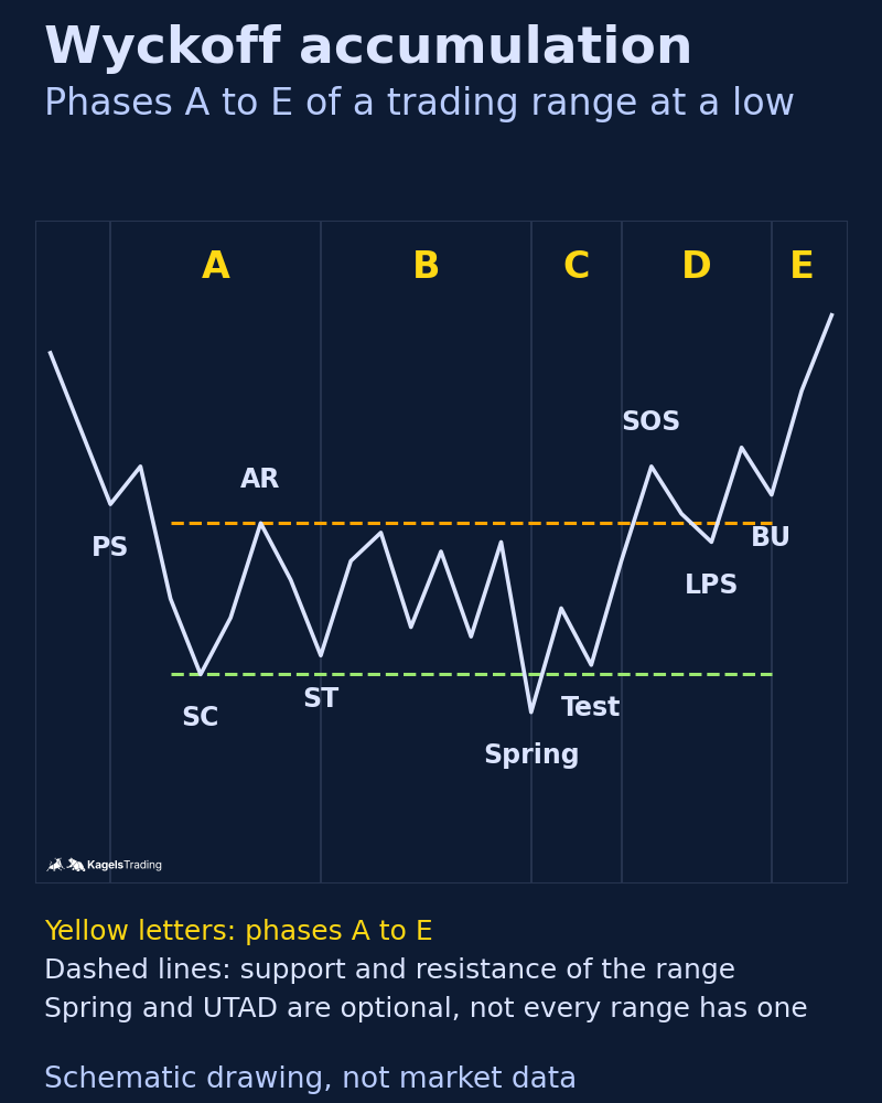
Wyckoff accumulation is a trading range after a decline in which supply is gradually absorbed before an advance begins. The schematic below is the standard map. Real ranges are rarely this tidy: phases can be shorter or longer, events can be missing, and the range can still fail.
 Click to enlarge
Source: Kagels Trading, own drawing.
- Phase A, the stop of the decline: preliminary support (PS) slows the fall, a selling climax (SC) on very high volume marks the low, an automatic rally (AR) sets the top of the range, and a secondary test (ST) revisits the low on less volume.
- Phase B, building the cause: price swings inside the range, often for months. Volume on the down swings should shrink over time as supply dries up.
- Phase C, the test: a spring pushes briefly below support and comes back. It tests whether any supply is left. If volume is low and price returns quickly, the test passed. Many ranges have no spring at all.
- Phase D, demand takes over: a sign of strength (SOS) on rising volume pushes towards or above resistance, and pullbacks hold at a last point of support (LPS).
- Phase E, the markup: price leaves the range. A backup (BU) to the old resistance is common before the advance continues.
A spring is a short move below the support of an accumulation range that quickly comes back inside and tests whether supply is exhausted. Today many traders call this a liquidity sweep or stop run. A spring alone is not a buy signal: the follow-through in phase D decides whether the reading was right. If price stays below support, the range was not accumulation, or not yet.
Wyckoff distribution: phases A to E
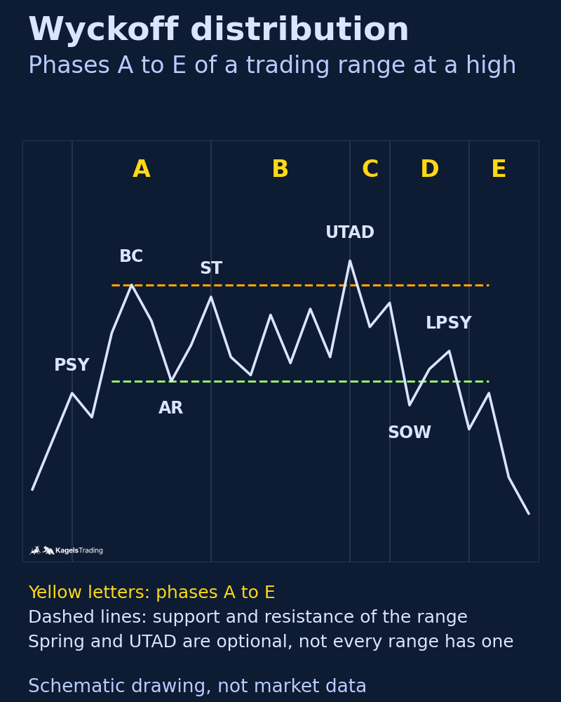
Wyckoff distribution is a trading range after an advance in which demand is gradually absorbed before a decline begins. It mirrors accumulation, with its own names for the events.
 Click to enlarge
Source: Kagels Trading, own drawing.
- Phase A, the stop of the advance: preliminary supply (PSY) appears, a buying climax (BC) marks the high on heavy volume, an automatic reaction (AR) sets the bottom of the range, and a secondary test (ST) revisits the high.
- Phase B, building the cause: price swings inside the range. Rallies on less volume and declines on more volume are typical.
- Phase C, the test of demand: an upthrust after distribution (UTAD) breaks briefly above resistance and fails. Like the spring, it is optional.
- Phase D, supply takes over: a sign of weakness (SOW) breaks towards or below support, and rallies fail at a last point of supply (LPSY).
- Phase E, the markdown: price leaves the range downwards, and rallies back to the old support often fail there.
An upthrust after distribution (UTAD) is a short move above the resistance of a distribution range that quickly falls back inside and tests whether demand is exhausted. At the time it happens, a UTAD looks exactly like a breakout, and only the next bars tell the difference. That is the main difficulty of the method, and the next example shows it on a real chart.
Example 1: TSMC’s distribution of 2021 and 2022
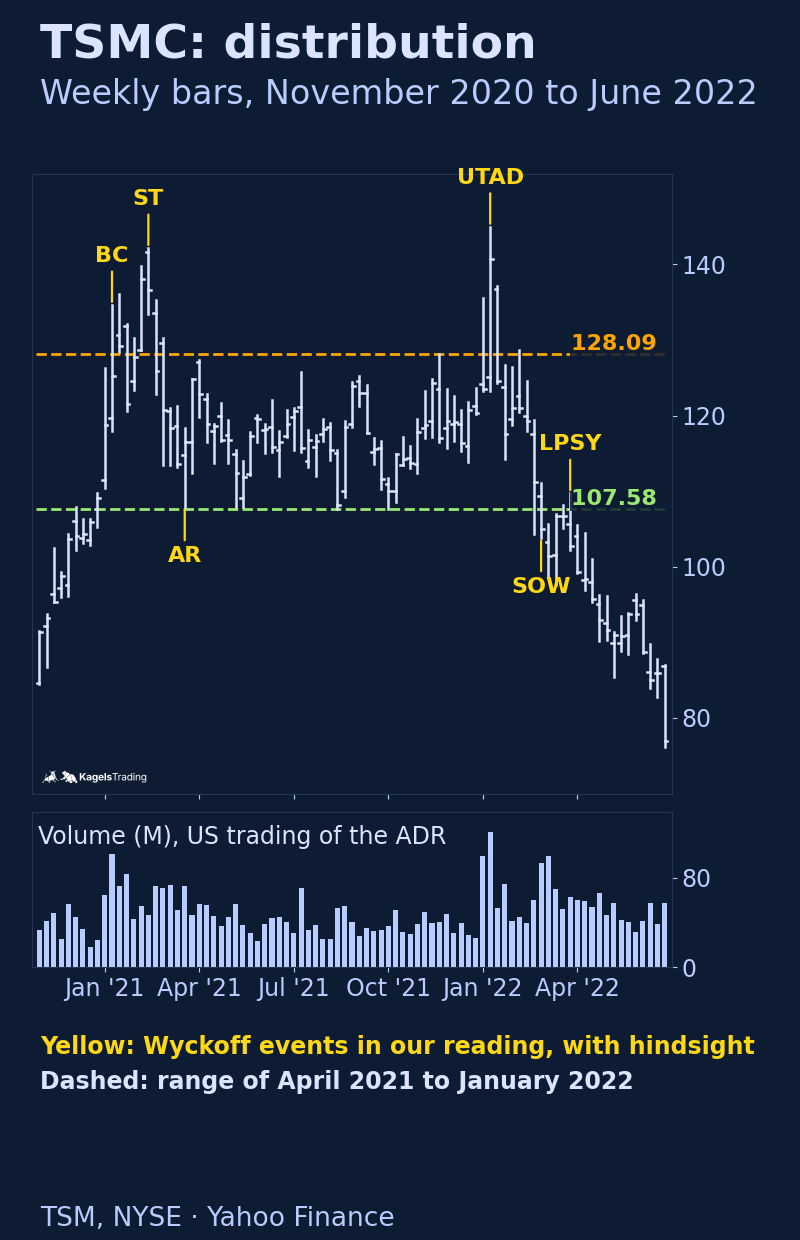
TSMC, the world’s largest contract chip maker, built a textbook-like distribution range between January 2021 and February 2022. We use the company’s American depositary shares (ticker TSM) on the NYSE. One TSM share represents five shares of the Taiwan listing, and the volume in our charts covers only the US trading of the ADR, not trading in Taipei. That is a real limit for a method that relies on volume.
 Click to enlarge
Read with hindsight, the events fall into place. In the week of January 11, 2021, TSM rose to $134.65 on 101 million shares, the highest weekly volume of the whole period before 2022: a candidate for the buying climax. In February 2021 a new high of $142.20 came on only 47 million shares, more price for much less effort. The decline to $107.89 in March 2021 marked the automatic reaction, and from April 2021 to early January 2022 the stock moved between roughly $107.58 and $128.09.
The decisive week was the week of January 10, 2022. After quarterly results on January 13, TSM jumped to $145.00, above every high of the range, and closed at $140.66 on 121 million shares. At that weekly close the bar looked like a sign of strength and a breakout, and our guide to Stage Analysis uses the very same week as a breakout that failed. One week later TSM closed at $124.53, back inside the range. Only then did the reading shift towards an upthrust after distribution.
What followed matches phases D and E. In the week of February 28, 2022, TSM closed at $105.06, below the range low of $107.58, on 93 million shares, followed by 99 million the next week: a sign of weakness. The rally in late March 2022 reached $109.76, just above the old support, and closed the week at $102.79 on less volume, a typical last point of supply. By October 2022 the stock had fallen to $59.43.
A competing reading existed until the end. Before January 2022 the same range could also have been re-accumulation, a pause within the uptrend, and the January 2022 jump its sign of strength. The chart decided between the two readings only afterwards. This is not a flaw of the example but the normal situation: Wyckoff labels are hypotheses that the next bars confirm or reject.
Example 2: TSMC’s accumulation of 2022 and 2023
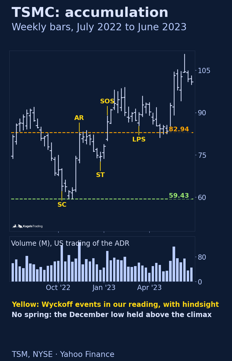
The low of the same stock nine months later shows an accumulation range without a spring. In the week of October 10, 2022, TSM fell to $62.32 on 117 million shares, the highest weekly volume of the year so far: a candidate for the selling climax. In the following three weeks the price slipped slightly lower, to $59.43, on less volume.
 Click to enlarge
The automatic rally came with news. On November 14, 2022, Berkshire Hathaway disclosed a new stake in TSMC in its quarterly 13F filing, and TSM rose to $82.94 that week on 127 million shares. The secondary test in late December 2022 held at $72.84, far above the climax low, on only 38 million shares, the lowest weekly volume since September. Supply had dried up.
Phase D started with quarterly results on January 12, 2023. That week TSM closed at $86.80, above the automatic rally high of $82.94, on 99 million shares: a sign of strength. The pullback in March 2023 held at $85.44, above the old resistance, which fits a last point of support. By June 2023 the stock had reached $110.69. There was no spring: the lows of December and March held above the climax, and the reading still works without one.
Volume data: what Wyckoff needs and what you have
The Wyckoff method stands and falls with the quality of the volume data. For stocks and futures on one exchange, volume is the number of shares or contracts traded. For a stock listed in several places, such as TSMC, any single feed shows only part of the trading. Use one consistent source and say which one.
In spot forex there is no central exchange and therefore no complete volume. Retail platforms usually show tick volume, the number of price changes, which is at best a proxy. If you apply Wyckoff to currencies, the futures on a regulated exchange give you real contract volume for that market, but still not for the whole currency market.
Wyckoff’s five steps in practice
Wyckoff schools today summarise the practical approach in five steps. The numbered list is a later formulation, but its content, trading in harmony with the trend and choosing the strongest stocks, is in Wyckoff’s course.
- Determine the trend: is the market in an uptrend, a downtrend or a range? Decide whether long or short positions fit.
- Choose stocks in line with the trend: in an uptrend, the stocks stronger than the market; in a downtrend, the weaker ones.
- Judge the cause: is the range large enough for a move that justifies the risk?
- Check readiness: do price and volume show that the stock is ready to move, for example after a spring or a sign of strength?
- Time the entry and set the stop: enter in harmony with the market and place the stop where your reading would be wrong.
Wyckoff, Stage Analysis and Smart Money Concepts
Several later methods build on Wyckoff’s ideas, but they are not the same. Stage Analysis by Stan Weinstein uses a 30-week moving average and relative strength to sort stocks into four stages. Its Stage 1 resembles accumulation, but a base is not proof that institutions are buying. Volume spread analysis (VSA) zooms in on single bars and their volume. Smart Money Concepts use terms such as liquidity sweeps and order blocks; the sweep is close to Wyckoff’s spring.
Advantages and limits of the Wyckoff method
The method’s strength is that it makes you think about supply and demand instead of following an indicator. It works on any market with reliable volume, it gives a structure to sideways phases that most traders find confusing, and it combines well with support and resistance and breakout planning.
Its weakness is subjectivity. Two analysts can label the same range differently, accumulation and distribution look alike in the early phases, and many events are clear only afterwards. We know of no rigorous study that proves an edge for Wyckoff trading as a whole, and success stories do not replace a test. Use it as a frame, with written rules for entry and stop, and the risk on each trade limited in advance.
My conclusion on the Wyckoff method
I have traded discretionary price action since 1980, and I count Wyckoff’s logic among the most honest tools of technical analysis. It forces you to ask who is in control, buyers or sellers, instead of waiting for an indicator to cross a line. That is exactly what I value about it.
At the same time, I am realistic about it. Recognising accumulation and distribution, timing the tests and handling failed ranges is demanding in practice. The cycle does not always follow the textbook order, and beginners easily mix up the phases.
My advice: use Wyckoff as a framework, not as the only truth. Combined with price action, clear key levels and a careful reading of volume, it becomes a valuable part of a complete trading approach. When a label does not fit the next bars, change the label, not the stop.
Frequently asked questions about the Wyckoff method
What is the Wyckoff method?
The Wyckoff method is an approach to technical analysis by Richard D. Wyckoff that reads price and volume to judge supply and demand. It focuses on trading ranges and describes them with the accumulation and distribution schematics, each divided into phases A to E.
What is the difference between Wyckoff accumulation and distribution?
Accumulation is a range after a decline in which supply is absorbed; distribution is a range after an advance in which demand is absorbed. Accumulation tends to end in an advance, distribution in a decline. In the early phases they look alike, so the decision usually comes only with a sign of strength or weakness.
What is a Wyckoff spring?
A spring is a short move below the support of an accumulation range that quickly returns inside the range. It tests whether any supply is left. A spring on low volume with a fast return supports the accumulation reading, but it is optional and no buy signal on its own; the follow-through in phase D decides.
What is the Composite Man?
The Composite Man is a teaching model: you imagine the market as if one large operator planned the accumulation, markup, distribution and markdown. It helps you ask what a large buyer or seller would do at a given point. It does not mean that one actor controls the price, and the chart cannot prove anyone’s intention.
Does the Wyckoff method still work?
The principles of supply and demand still apply, but there is no proof that Wyckoff trading produces an edge by itself. The method gives a structure for reading ranges. Whether it works for you depends on written rules, risk management and enough practice to label ranges consistently.
Which time frame suits the Wyckoff method?
Most Wyckoff analysts work on daily and weekly charts, because ranges there take weeks to months and volume is more meaningful. Shorter time frames such as 4-hour or 1-hour charts can help to time an entry inside a larger range. The shorter the chart, the more noise you get.
This English edition is based on our German edition on kagels-trading.de and has been adapted for international readers.
More Chart Techniques guides
- Draw key levels
Support and Resistance: How to Draw and Use Key Levels
Where useful levels come from, how to draw zones with a stated rule and how to turn a level into a trade plan.
- Read price action
Price Action Trading: How to Read Charts Without Indicators
Market structure, key zones and three bar patterns, with a core setup and a real SPY example where the signal failed.
- Trade breakouts
Breakout Trading Strategy: Entries and False Breakouts
How often breakouts fell back into the range in our count of 1,472, and how to plan entry, stop and position size.
- Draw and trade trendlines
Trendline Trading: How to Draw Trendlines and Trade Them
How to draw trendlines with a fixed rule, four strategies for bounces, breaks and retests, and a real SPY line break without a lasting reversal.
- Use Fibonacci levels
Fibonacci Retracement Levels: How to Draw and Trade Them
How to calculate and draw retracement levels, trade pullbacks with confluence and a stop at the structure, and what a ten-year test says about the levels.
- Set Fibonacci targets
Fibonacci Extension: Levels, How to Draw It and Calculator
Three-point extension targets from the end of a pullback, why they differ from levels beyond 100%, a free calculator and three SPY swings, one without a single target reached.
- Trade gaps
Gap Trading Strategy: How to Trade Gaps and When Gaps Fill
Opening and full gaps, the four classic gap types, how often SPY gaps filled in our count since 2001, and plans for gap fill and gap and go.
- Calculate pivot points
Pivot Points: Formulas, Types and How to Trade Them
Formulas for standard, Fibonacci, Woodie, Camarilla and DeMark pivots, a free calculator, which session counts and a real SPY day.
- Swing trade
Swing Trading: 4 Strategies, Risk and Real Examples
Four swing trading strategies on the daily chart, position size, gap risk and US rules, with two hypothetical SPY pullbacks: one hit its target, one was stopped out.
- Identify market stages
Stage Analysis: Stan Weinstein's Four Market Stages
Stan Weinstein's four stages on the weekly chart, a Stage 2 checklist and two TSMC breakouts: one ran for a year, one gapped through its stop.
- Trade Darvas boxes
Darvas Box Strategy: Rules, Entries and Stop Losses
The box rules step by step, when the edges become known, where the stop goes, and a mechanical test on TSMC in 2024 with two honest results.