
MACD Indicator: Histogram, Divergence and a 31-Year Test


Contents
- MACD indicator in 30 seconds
- What is the MACD indicator?
- How to calculate the MACD: formula and a worked example
- MACD histogram: what the bars show
- MACD signals: crossovers and the zero line
- MACD divergence: how to spot bullish and bearish divergences
- My test: what MACD signals did over 31 years
- MACD settings: 12, 26, 9 or faster?
- How to add the MACD in TradingView
- How to combine the MACD with price action and other indicators
- Advantages and disadvantages of the MACD
- My conclusion: the MACD describes momentum, it does not predict it
- Frequently asked questions about the MACD indicator
- About the author
Four weeks after a MACD buy signal, the S&P 500 was higher in 63.8% of cases, slightly less often than after any trading day. That is one result of my test with 31 years of daily data from the S&P 500 and the German DAX. It does not make the MACD useless. You just need to know what it is good for.
In this guide you learn how the MACD is calculated, what the MACD line, the signal line and the histogram show, and how to draw a divergence. Then you see the numbers from my test and what different settings change. At the end you know where the indicator helps you and where it can mislead you. This article follows our editorial policy.
MACD indicator in 30 seconds
- It measures the gap between two averages: a fast and a slow exponential moving average (an average that weights recent prices more), by default 12 and 26 days. From this gap you read the momentum, meaning the direction and speed of the move.
- It has three parts on your chart: the MACD line, the signal line (a 9-day average of the MACD line) and the histogram, which shows the gap between the two.
- It gives three kinds of signals: signal line crossovers, zero line crossovers and divergences between price and MACD.
- My test made money, but far less than the index: 341 crossover trades in the S&P 500 since 1995 returned 3.46% a year in a hypothetical model calculation, buy and hold 11.25%.
- Bearish divergences rarely ended the rise: after 85.3% of them in the S&P 500, the second price high was exceeded within 60 trading days.
- It works best as context for the trend, not as the trigger for an entry. Set entries at price.
What is the MACD indicator?
The MACD indicator (Moving Average Convergence Divergence) is a momentum indicator that measures the gap between a fast and a slow exponential moving average of the price.
Gerald Appel developed the MACD in the 1970s, according to the indicator documentation of TradingView. Wikipedia dates it to the late 1970s. The name describes what the indicator watches: two moving averages run towards each other (convergence) or away from each other (divergence). Momentum here means the direction and speed of the price move.
Why is this gap interesting? The fast average follows the price more closely than the slow one. When a trend speeds up, the fast average pulls away and the gap grows. When the trend slows down, the slow average catches up. So the MACD turns the lag that every average has into a measure of how strong a move is.
That makes it two tools in one. It shows the direction like a trend indicator and the acceleration like an oscillator, an indicator that swings around a center line. Unlike the RSI (Relative Strength Index) or the stochastic, it has no fixed scale from 0 to 100. A reading of 200 in the DAX or of 30 in the S&P 500 therefore says nothing about overbought or oversold.
I trade without indicators myself, based only on price action and market structure. For price action traders the MACD is still useful, because it answers a question that every chart raises: does the trend still have strength? That is exactly what it was built for. How I read the bars themselves is explained in the guide to price action trading.
How to calculate the MACD: formula and a worked example
The MACD line is the 12-day exponential moving average (EMA) of the closing prices minus the 26-day EMA. The signal line is the 9-day EMA of the MACD line, and the histogram is the MACD line minus the signal line.
EMA stands for exponential moving average, an average that gives recent prices more weight than older ones. It therefore reacts faster than a simple moving average (SMA), which weights every day the same. As formulas:
- MACD line = EMA(12) − EMA(26)
- Signal line = EMA(9) of the MACD line
- Histogram = MACD line − signal line
Here is a real worked example from the S&P 500, based on the close of October 9, 2026 at 7,811.54 points:
| Value | Result |
|---|---|
| EMA(12) | 7,747.78 points |
| EMA(26) | 7,713.31 points |
| MACD line | 34.47 |
| Signal line | 23.33 |
| Histogram | 11.13 |
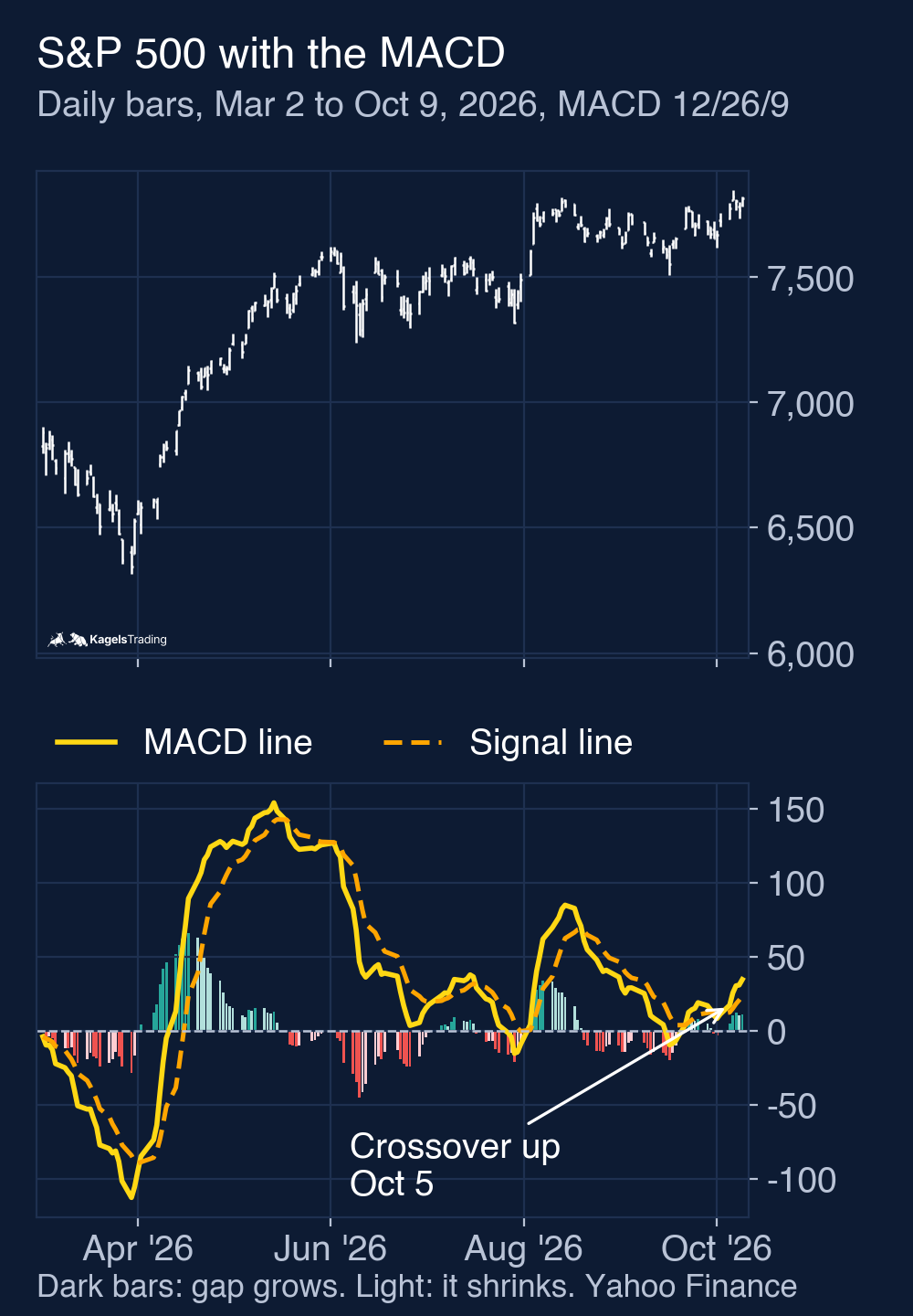
What do these numbers say? The fast average is 34.47 points above the slow one, so the S&P 500 is stronger in the short term than on its medium-term average. The MACD line is also above its signal line: it crossed above it on October 5, 2026. The day before, the histogram was 10.18, so the gap was still growing. The values come from my own calculation with prices from Yahoo Finance since 1994. I calculate with unrounded values and round only for the table, so the histogram can differ from the rounded lines by 0.01. Other data feeds, a different start of the data or a signal line based on a simple average give different values. According to its indicator help, MetaTrader 5 calculates the signal line as a simple 9-period average (SMA). TradingView lets you choose EMA or SMA for both lines.
You do not have to calculate this yourself. Every charting platform shows the MACD ready-made. What matters is that you know which settings and which average type your software uses, so you can compare its values with an example like this one.
MACD histogram: what the bars show
The MACD histogram shows the gap between the MACD line and the signal line as bars. When the MACD line is above the signal line, the bar is positive; when it is below, the bar is negative.
The histogram came later. According to TradingView, Thomas Aspray added it in 1986. It adds no new information, but it makes visible what is otherwise hidden between two lines that run close together: how fast the gap is changing right now.
 Click to enlarge
How to read the chart above. The upper panel shows the daily bars of the S&P 500, the lower panel the yellow MACD line, the dashed orange signal line and the bars. Dark bars mean that the gap is growing; light bars mean that it is shrinking. On April 2, 2026 the histogram turned positive, three trading days after the lowest close of the year (6,343.72). The MACD line itself only crossed zero on April 13. From May 14 to June 26 the MACD line fell from 153.8 to 3.4, although the index never closed more than 5% below its high in that period.
When a bar flips from negative to positive, it is the same crossover that you see on the lines. That is why you can hide the histogram in the settings and only watch the lines. The only thing you lose is the early view of the bars getting shorter.
Do not confuse the two zero lines. The histogram has its own zero line. When the MACD line itself crosses zero, the 12-day EMA has crossed the 26-day EMA. That is a different signal: it marks a crossover of the two price averages, not of the MACD and signal lines.
Shrinking bars are an early warning, not a signal. When positive bars get shorter, the upward momentum is fading; when negative bars get shorter, the downward momentum is fading. In a strong uptrend, the positive bars often shrink several times without the trend turning. If you treat every shrinking bar as an exit, you get out far too early in the strongest phases.
MACD signals: crossovers and the zero line
The best-known MACD signal is the signal line crossover. When the MACD line crosses above its signal line, traders read it as a buy signal. When it crosses below, they read it as a sell signal. The same idea is behind the golden cross and the death cross, but those use the 50-day and 200-day averages and are much slower.
The second signal is the zero line crossover. When the MACD line rises above zero, the fast average is above the slow one. Traders read that as confirmation of an uptrend. When it falls below zero, it points to a downtrend. There is no fixed order between this signal and the signal line crossover: either can come first.
You can combine both signals. An obvious filter buys only when the upward crossover happens below the zero line, which often follows a pullback. For long positions this resembles the classic pullback entry, although a crossover below zero does not prove that an uptrend is still intact. The mirror image for short positions looks for a downward crossover above the zero line. I have not tested this short version. What the filter changes for buy signals is shown in my test below.
What none of the crossovers gives you is a price target. The MACD tells you when momentum turns, not how far the price runs afterwards. You set the profit target at chart levels, for example at earlier highs or at a zone of support and resistance. Pullbacks to a Fibonacci retracement can also serve as a guide. For the exit in a running trade, a trailing stop is often more useful than the next opposite crossover.
MACD divergence: how to spot bullish and bearish divergences
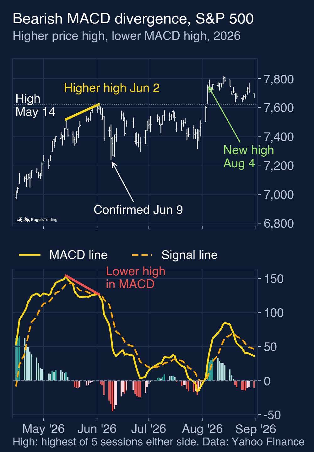
A MACD divergence occurs when price and MACD move in opposite directions: price makes a higher high while the MACD makes a lower high, or price makes a lower low while the MACD makes a higher low.
A divergence shows that a new extreme is reached with less force than the one before. The gap between the averages gets smaller although the price keeps going. There are two directions:
- A bearish divergence forms in an uptrend: price makes a higher high, but the MACD only makes a lower high. This points to an end of the rise.
- A bullish divergence forms in a downtrend: price makes a lower low, but the MACD already makes a higher low. This points to an end of the decline.
 Click to enlarge
The chart above shows a recent bearish divergence in the S&P 500. On May 14, 2026 the high was 7,517.12 points, on June 2 it was 7,620.90 points. Over the same period the MACD line fell from 153.8 to 126.5. The second high was confirmed on June 9, five trading days later. The index closed at 7,266.99 one day after that, but on August 4 it traded above the June high. This is a chart example, not a tested trade, and the test below shows why no rule follows from it.
In the DAX, a divergence in the same summer was followed by a decline. Its highs on August 12 and 28, 2026 were 26,573.5 and 26,618.7 points, while the MACD line fell from 352 to 226. The divergence was confirmed on September 4. On October 8 the DAX closed at 24,807 points. This is a chart example, not a tested trade. Both divergences were followed by a dip at first, but one market went on to a new high and the other kept falling: that is exactly why a divergence is a warning, not a forecast.
To draw a divergence, connect the two highs in the price chart and draw a second line in the MACD panel below. Both lines must start and end at the same bars. If they point in different directions, you have a divergence. For lows it works the other way round. How to place such lines cleanly is explained in the guide to trendline trading. The same reading works for the RSI.
A divergence is a warning, not an entry. Strong trends often form two or three divergences in a row and still keep going. The trigger only comes from price, for example a break of the last support. The hidden divergence is different: TradingView’s documentation describes it as a possible hint at a continuation of the trend, not at its end. In an uptrend, price makes a higher low while the MACD makes a lower low.
My test: what MACD signals did over 31 years
I wanted to know whether the textbook signals hold up in real data. I tested the MACD 12/26/9 on daily closes of the S&P 500 and the DAX, from January 1995 to October 9, 2026. Signals come from the daily close. The trade happens at the next day’s open, with 0.05% costs per buy and per sell. Long only, no short sales. This is a hypothetical model calculation, not a track record. How a test has to be built to mean anything is explained in my guide to backtesting.
Two details matter for the S&P 500 numbers. Before 2006, Yahoo’s S&P 500 index series frequently reports the previous close as the next day’s opening price. A test that “buys at the next open” on that series would often fill at the signal close. So the signals come from the index closes, but the trades are executed at the next open of SPY (SPDR S&P 500 ETF Trust). SPY dividends are counted on the ex-date and reinvested at that day’s close while a position is held. The DAX is a total return index with dividends reinvested, and its trades are calculated on index levels without any product costs, while SPY’s fund costs are already in its price. Cash earns no interest, and taxes are left out.
Crossovers as a trading system
The first question: what happens if you trade every crossover? Buy on the upward crossover, sell on the downward crossover. Here is the result compared with buy and hold:
| Metric | S&P 500 (via SPY) | DAX |
|---|---|---|
| Trades | 341 | 351 |
| Win rate | 43.1% | 42.5% |
| Average win / average loss | 3.10% / −1.70% | 3.85% / −2.26% |
| Return per year | 3.46% | 2.77% |
| Buy and hold per year | 11.25% | 8.13% |
| Largest drawdown | −34.1% | −59.1% |
| Drawdown buy and hold | −55.2% | −72.7% |
| Time in the market | 50.0% | 50.6% |
The crossovers made money, but much less than the index. In the model calculation, $10,000 in the S&P 500 grew to $29,501; buy and hold turned it into $295,554. In the DAX, €10,000 grew to €23,845 against €119,831. The win rate is below 50%. The result is carried by the realized ratio of average win to average loss. That is not the same as a planned risk/reward ratio, because the system had no stops and no targets. The smaller drawdown fits the fact that the system was invested only half the time. In a long bull market, exactly this time out of the market is the likely reason for the gap. The last S&P 500 trade, bought on October 6, 2026, was still open on October 9 and is valued at that day’s close without selling costs.
Does the zero line filter help?
It helps the win rate, but not the return. With only the crossovers below the zero line, the win rate in the S&P 500 rose to 47.9% on 140 trades, and the profit factor (total gains divided by total losses) rose from 1.38 to 1.61. In the DAX it was 49.7% on 147 trades with a profit factor of 1.35. Crossovers above the zero line delivered only 39.8% and 37.3% winners and almost nothing in return: 0.21% and 0.40% a year. The return of the filter fell slightly in both markets, from 3.46% to 3.25% a year in the S&P 500 and from 2.77% to 2.36% in the DAX. The largest drawdown got smaller in both: −25.2% and −55.1%.
Do the signals beat the base rate?
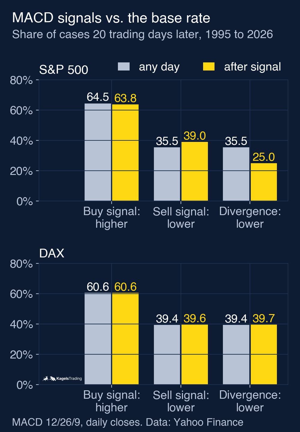
This is the question that really matters, and the answer is sober. I measured how often the index was higher or lower 20 trading days after a signal and compared that with the base rate: all trading days of the period. This part uses index closes only. The chart below shows both markets.
 Click to enlarge
In the S&P 500, the index was higher after a buy signal in 63.8% of cases (217 of 340), slightly less often than the base rate of 64.5%. After a sell signal it was lower in 39.0% of cases (133 of 341), a little more often than the 35.5% base rate. In the DAX, buy signals were exactly at the base rate: 60.6% (212 of 350) against 60.6%. Sell signals were at 39.6% against 39.4%. In this sample, the buy signals had no visible edge. This is not a statistical proof, because the 20-day windows overlap and are not independent.
Divergences in the test
For the divergences I needed a fixed rule, otherwise there is nothing to count. A price high is a daily high that is at least as high as every daily high of the five trading days before and after. Two neighboring price highs 10 to 60 trading days apart, the second one higher, the MACD lower at the second high than at the first and above zero at the first high: that is a bearish divergence. The MACD is measured on the days of the price highs, not at its own peaks. The signal counts from the fifth trading day after the second high, because only then is the high confirmed.
The S&P 500 had 77 bearish divergences by this rule. 20 trading days later the index was lower in 19 of 76 cases (25.0%), even less often than on an average day (35.5%). In 64 of 75 fully observed cases (85.3%), the second high was exceeded within the next 60 trading days. Pullbacks in between are not excluded. The DAX had 68 divergences: 27 of 68 with a lower index after 20 trading days (39.7%), barely more often than on any day, and 56 of 67 (83.6%) with the second high exceeded. Bullish divergences occurred only 10 and 13 times by this rule. That is too few to say anything.
How much lag is in the signal?
With 12/26/9, the buy signal came a median of five trading days after the lowest close since the previous sell signal, seen in hindsight. By then the S&P 500 was already 2.73% above that low, the DAX 3.31%. The smoothing causes this lag. How large it is also depends on the setting and on the price path.
The limits of this test belong here too. It is a hypothetical model calculation on two large stock indices on daily data, without stops, without short sales and without other filters. Single stocks, currencies or intraday charts can behave differently. The divergence rule is one of many possible definitions. I calculated everything with prices from Yahoo Finance as of October 9, 2026. This is market analysis, not investment advice.
MACD settings: 12, 26, 9 or faster?
12/26/9 is the common default setting and applies to whatever timeframe you are looking at. On a daily chart it means days, on an hourly chart hours. Faster values make the MACD more sensitive, slower values make it calmer. I tested three other settings against the default, again with every crossover since 1995. In the S&P 500 they produced between 8.5 signals a year (19/39/9) and 18.4 (5/35/5). The table shows the return per year:
| Setting | S&P 500 | DAX |
|---|---|---|
| 8/17/9 | 2.35% | 2.15% |
| 12/26/9 | 3.46% | 2.77% |
| 19/39/9 | 3.53% | 4.06% |
| 5/35/5 | −0.11% | 1.22% |
Faster does not mean better here. The fast settings produce more signals and therefore more costs and more false signals. The slow setting 19/39/9 did best in both markets, in the S&P 500 only just ahead of the default. No setting came anywhere near buy and hold. If you keep turning the settings until the past looks good, you are optimizing for noise.
This test does not find a best setting for day trading, because I did not test intraday prices. 12/26/9 is a reasonable starting point. If you use a shorter timeframe, test it separately, including costs. A MACD on a 15-minute chart reacts faster than one on a daily chart anyway. For swing trades that last several days, many traders use the daily chart. For position trading over weeks or months the weekly chart is common, where the lag is smaller compared with the holding period. I did not test either.
How to add the MACD in TradingView
In TradingView the MACD is on your chart in a few steps. Open a chart, click Indicators at the top and type “MACD” into the search field. Choose “Moving Average Convergence Divergence”. It appears in its own panel below the price, with the MACD line, the signal line and the histogram.
- Check the three lengths first: in the settings, Fast length is 12, Slow length 26 and Signal length 9. Leave them like this to start with.
- Check the source and the average type: Source should be the close, and both Oscillator MA type and Signal MA type should be EMA. Only then are the values comparable with this article.
- Adjust the display to your taste: on the Style tab you can hide the histogram if the bars distract you.
The free TradingView plan is enough for the MACD. If you want several indicators on one chart, you will soon reach the indicator limit of the free plan. Plans and prices are compared in my guide to TradingView, and you can open a chart directly on TradingView.
How to combine the MACD with price action and other indicators
Because the buy signals alone had no edge over the base rate in my 20-day window, context is what counts. The MACD is most useful as the answer to a question you should ask before every trade: does the move you want to trade still have strength? The entry itself is better placed at price, using price action and chart levels.
With a trend filter you sort out signals against the bigger direction. A simple one is the 200-day moving average: only take buy signals when the index is above it. I did not test this filter. The ADX, a pure trend strength indicator, can add a view on how strong the trend is, but it does not decide on its own whether following it pays.
With a bounded oscillator you add what the MACD lacks: an indicator with a fixed scale. The RSI and the stochastic run from 0 to 100 and show whether a market is overbought. If MACD and RSI both show a divergence at the same high, you have two hints, but not independent ones: both are calculated from the same price series.
With chart patterns and volume you get the place for the signal. A crossover at a breakout from a range gives more context than one in the middle of a sideways phase, and volume analysis can show whether the move had participation. Whether such combinations improve results would need its own test.
Advantages and disadvantages of the MACD
The MACD has clear strengths and one big weakness. This summary is based on my test and on how the indicator is built.
What speaks for the MACD
- Two readings in one panel: trend direction and momentum.
- Available on every charting platform: in all common charting software, with the default 12/26/9.
- An early warning from the bars: the histogram shows fading strength before the crossover.
- A zero line filter that changes something: crossovers below the zero line raised the win rate in the test to almost 50%, at a slightly lower return.
What speaks against the MACD
- Lag built into the calculation: buy signals came a median of five trading days after the lowest close, seen in hindsight.
- No edge for the buy signals: over 31 years, buy signals in the S&P 500 and the DAX were at the base rate.
- Divergences were unreliable warnings: after bearish divergences, the second high was usually exceeded soon.
- No fixed scale for extremes: no statement about overbought or oversold.
My conclusion: the MACD describes momentum, it does not predict it
The MACD measures whether a trend has strength, and it does that well. As the only trigger for buying and selling it did not convince me in my test: in the S&P 500 and the DAX, its buy signals had no visible edge over the base rate over 31 years, and after bearish divergences the second high was usually exceeded soon. The zero line filter improves the win rate, but it does not come close to buy and hold.
In practice that means two things. Use the MACD as context: is the trend still running, is it getting weaker, does your setup fit the direction? Set your entry and your target at price and at chart levels. Used like this, the MACD is a useful companion. For current levels on the index itself, see my S&P 500 forecast.
Frequently asked questions about the MACD indicator
What is the MACD in simple terms?
The MACD is a momentum indicator that measures the gap between a fast and a slow exponential moving average. When the gap grows, the trend gains strength. When it shrinks, the strength fades. A signal line and a histogram complete it.
How is the MACD calculated?
The MACD line is the 12-day EMA minus the 26-day EMA of the closing prices. The signal line is the 9-day EMA of the MACD line, and the histogram is the MACD line minus the signal line. MetaTrader 5 uses a simple average for the signal line instead.
What does the MACD histogram show?
The histogram shows the gap between the MACD line and the signal line as bars. Positive bars mean the MACD line is above the signal line. When positive bars get shorter, upward momentum is fading; when negative bars get shorter, downward momentum is fading. This often shows before the lines cross.
What is a MACD divergence?
A MACD divergence occurs when price and MACD move apart. If price makes a higher high while the MACD makes a lower high, the divergence is bearish. In my test over 31 years of the S&P 500, the second high was still exceeded within 60 trading days in 85.3% of the fully observed cases.
What are the best MACD settings for day trading?
My test on daily prices does not find a best day trading setting. On daily data, faster values such as 8/17/9 gave more signals but less return than 12/26/9. For day trading, 12/26/9 is a reasonable starting point. Test your intraday timeframe separately, including costs.
What does it mean when the MACD is above zero?
Then the 12-day EMA is above the 26-day EMA. The short-term average price is higher than the medium-term one, which points to an uptrend. Below the zero line the opposite applies.
Is the MACD a good indicator?
As context yes, as a stand-alone signal no. It shows trend and momentum reliably. In my test, however, its buy signals had no visible edge over the base rate. It works best together with chart levels and a clear entry at price.
This English edition is based on our German edition on kagels-trading.de and has been adapted for international readers.