
Moving Averages: SMA, EMA and a 76-Year 200-Day Test


Contents
- Moving averages in 30 seconds
- What is a moving average?
- How to calculate SMA, EMA and WMA
- SMA vs EMA: speed against false signals
- Common periods: 20, 50 and 200 days
- The 200-day moving average: what 76 years of S&P 500 data show
- The 200-day line as a filter: less risk, less return
- Moving average crossovers
- Are moving averages support and resistance?
- How to set up a moving average on your chart
- Advantages and disadvantages of moving averages
- My conclusion: a good map, a poor trigger
- Frequently asked questions about moving averages
- About the author
A moving average smooths past prices, and it is easy to misread. It smooths the daily noise so you can see the direction. But it always looks back, so it always reacts late. In this guide you learn how the three common types are calculated, why an EMA turns earlier than an SMA, and which periods traders use.
Then you see what the 200-day average actually did on the S&P 500 over 76 years. I split every trading day since 1950 into days above and below the line and tested it as a filter against buy and hold. The result shows clearly what the line is good for and what it costs. This article follows our editorial policy.
Moving averages in 30 seconds
- Definition: a moving average is a smoothed line of past closing prices, recalculated with every new bar; the simple version averages a fixed number of closes.
- Three common types: the simple (SMA) weights all prices equally, the exponential (EMA) and the weighted (WMA) give recent prices more weight.
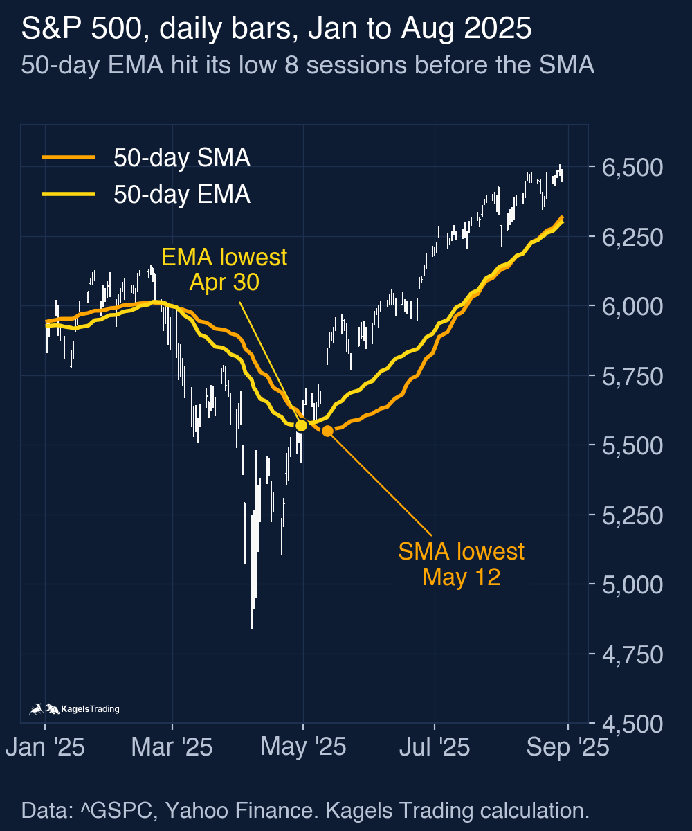
- The trade-off: a faster average reacts earlier but gives more false signals. In 2025 the 50-day EMA reached its low and started rising eight sessions before the 50-day SMA.
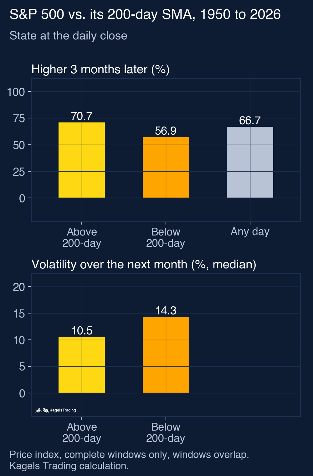
- Above the 200-day line, the S&P 500 was calmer: median volatility over the next month was 10.5% a year above the line and 14.3% below it.
- As a filter it reduced drawdown, but also return: from 1950 to 2026 it reduced the largest drawdown from 56.8% to 24.0%, but earned 7.2% a year instead of 8.2%, with 224 round trips.
What is a moving average?
A moving average is a smoothed measure of past closing prices that moves forward one bar with every new close.
The name says what it does. For a simple or weighted average, each day the newest close enters the calculation and the oldest one drops out, so the average moves along with the chart. An exponential average works differently: it updates yesterday’s value with today’s close and keeps a shrinking share of all older prices. On a daily chart, a 50-day simple average is the mean of the last 50 closing prices. On a weekly chart, a 30-week average covers about the same time as a 150-day average, which is the line used in Stage Analysis.
It is a description of the past, not a forecast. A rising simple average tells you that the newest close is higher than the one that dropped out; a rising EMA, that the newest close is above the previous EMA value. That is useful context, because it turns a jagged price line into one clear direction. It does not tell you what happens next, and it always lags behind the price.
I trade without indicators myself. I read price action, meaning bars, highs and lows. Many market participants watch the 200-day average on index charts. That makes it part of the context of a chart, but a moving average is never my entry signal.
How to calculate SMA, EMA and WMA
The three types differ in how they weight past prices. The formulas for a period of n bars follow below; all three use the closing price by default:
- Simple moving average (SMA): the sum of the last n closes divided by n. Every close counts the same.
- Exponential moving average (EMA): today’s EMA = close × k + yesterday’s EMA × (1 − k), with k = 2 ÷ (n + 1). For a 10-day EMA, k is 0.1818, so today’s close gets about 18% of the weight.
- Weighted moving average (WMA): the newest close is multiplied by n, the one before by n − 1, down to 1 for the oldest; the sum is divided by n × (n + 1) ÷ 2.
The EMA never forgets completely. Every past close keeps a small, shrinking weight, which is why an EMA started on different dates can show slightly different values. TradingView documents both lines in its help pages for the simple and the exponential moving average. My values come from my own calculation with S&P 500 closes from Yahoo Finance; the EMA starts in 1950 with an SMA as its first value.
Here is a worked example with the last ten closes up to October 15, 2026. The S&P 500 closed between 7,718.94 and 7,818.93 points in those ten sessions, and at 7,744.06 on the last day.
| Moving average on October 15, 2026 | Value |
|---|---|
| 10-day SMA | 7,777.00 points |
| 10-day WMA | 7,775.20 points |
| 10-day EMA | 7,759.32 points |
| 50-day SMA | 7,707.43 points |
| 200-day SMA | 7,267.62 points |
| 200-day EMA | 7,309.40 points |
The example shows the difference in one line. The SMA and the WMA use only these ten closes; the WMA gives the latest close 18.2% of the weight, the same share as the 10-day EMA. The EMA is still the lowest value, because it also carries weight from closes before the window: in late September the S&P 500 closed between 7,651.54 and 7,706.03, below most of the October closes. On that date the index was 6.6% above its 200-day SMA.
SMA vs EMA: speed against false signals
An EMA reacts faster than an SMA of the same length, because it weights the latest prices more. That sounds like a pure advantage. It is not: faster lines also turn more often on moves that do not last, which creates false signals.
 Click to enlarge
The spring of 2025 shows both sides. After the April 2025 sell-off, the 50-day EMA reached its lowest value on April 30 and closed higher from May 1. The 50-day SMA reached its lowest value only on May 12 and rose from May 13, eight sessions later. If you use the line to judge the trend, the EMA told you earlier that the decline had lost momentum.
The price of that speed is more noise. Over the full history since 1950, the S&P 500 close crossed its 200-day EMA 7.0 times a year on average, and its 200-day SMA 5.9 times. The 50-day SMA was crossed 15.5 times a year. Every crossing is a possible signal, and many of them are followed by a crossing back within days, as the filter test below shows.
Which one should you use? For a long-term trend filter, a slower line fits the job, and the 200-day SMA is a commonly quoted trend reference for the S&P 500. For short-term trading, an EMA follows the price more closely, which some traders prefer; that is a matter of style, not something my test measured. More important than the choice is that you stick to it. If you switch types after the fact, you will always find one that would have worked. The MACD indicator is built from two EMAs (12 and 26 days), so it shares their speed and their noise.
Common periods: 20, 50 and 200 days
Traders use a handful of standard lengths by convention. None of them is magic. They are useful because they are widely watched, and because they match common time frames.
| Period | Typical use |
|---|---|
| 10 or 20 days | Short-term trend, about two to four weeks of trading |
| 50 days | Medium-term trend, about a quarter of a year |
| 100 days | Between medium and long term, less common |
| 200 days | Long-term trend, about nine and a half months of trading days |
| 30 weeks | Weekly charts, used in Stage Analysis (about 150 days) |
On intraday charts the same logic applies to bars, not days. A 20-period average on a 5-minute chart covers 100 minutes. If you trade during the day, the VWAP is an alternative reference: it weights each price by volume and starts fresh every session. A moving average has no such reset and ignores volume.
The 200-day moving average: what 76 years of S&P 500 data show
The 200-day simple moving average (SMA) is the average of the last 200 daily closes and a commonly watched trend reference in stock markets. Financial media report when a major index crosses it, and many investors treat it as the line between a healthy and a weak market. I wanted to know what that line has actually said about the S&P 500.
I wrote the rules down before I calculated anything. Data: daily closes of the S&P 500 price index from January 1950 to October 15, 2026. After the 200 days needed to start the average, the count begins on October 18, 1950. For every day I recorded whether the close was above the 200-day SMA, and then measured what happened over the next 21, 63 and 252 trading days. Only complete windows count. Two variants were planned in advance: the 200-day EMA and the 50-day SMA. Both are reported below; nothing else was tested.
 Click to enlarge
| S&P 500, Oct 1950 to Oct 2026 | Close above 200-day | Close below 200-day | Any day |
|---|---|---|---|
| Share of all days | 71.6% | 28.4% | 100% |
| 3 months later higher | 70.7% (9,629 of 13,627) | 56.9% (3,089 of 5,430) | 66.7% (12,718 of 19,057) |
| 3 months later, median change | +2.9% | +1.9% | +2.7% |
| 12 months later higher | 75.9% (10,216 of 13,451) | 70.5% (3,819 of 5,417) | 74.4% (14,035 of 18,868) |
| 12 months later, median change | +9.6% | +13.0% | +10.5% |
| 12 months later, 10% worst cases below | −8.7% | −19.5% | −12.1% |
| Volatility next month, median | 10.5% | 14.3% |
Above the line, the market was calmer and more often higher three months later. Below the line, volatility was about a third higher, and three months later the index was higher in only 56.9% of cases. The windows are 21, 63 and 252 trading days long, they overlap, and the S&P 500 here is a price index without dividends. A close exactly on the line counts as below. These are descriptions of the past, not proof of an edge.
Over 12 months the picture is mixed, and that matters. Days below the 200-day line were followed by a higher median gain (13.0% against 9.6%), but also by much worse bad cases: in the weakest tenth, the index lost 19.5% or more. Below the line, the market swings more in both directions. Many of the strongest rebounds start there, and so do the deepest declines.
The two planned variants tell the same story with different strength. The 200-day EMA puts the market above the line more often; the 50-day SMA separates the two groups much less clearly. The 50-day count starts in March 1950, the 200-day counts in October 1950.
| Line | Days above | 3 months later higher, above / below | 3 months later median, above / below |
|---|---|---|---|
| 200-day SMA | 71.6% | 70.7% / 56.9% | +2.9% / +1.9% |
| 200-day EMA | 74.0% | 70.0% / 57.4% | +2.8% / +2.0% |
| 50-day SMA | 64.7% | 67.7% / 65.1% | +2.7% / +2.8% |
The 200-day line as a filter: less risk, less return
The classic use of the line is a simple rule: own the index while it closes above its 200-day average, hold cash while it closes below. I calculated that rule as a hypothetical index model. The signal is known at the close, and the model trades at the close of the next session, because this data has no reliable opening prices before 2006. Each trade costs 0.05%, cash earns nothing, and buy and hold uses the same price index.
| Oct 1950 to Oct 2026 | 200-day SMA filter | Buy and hold |
|---|---|---|
| Return per year | 7.2% | 8.2% |
| Largest drawdown | −24.0% | −56.8% |
| Volatility per year | 10.4% | 15.8% |
| Time in the market | 72% | 100% |
| Round trips | 224 | 1 entry |
In the two longest bear markets, the filter was mostly out. Between October 9, 2007 and March 9, 2009, the index lost 56.8% and the model 11.2%, because it held cash for most of that time. Between February 19 and March 23, 2020, the model lost 10.8% (its deepest point in between was 12.8% below the start). These are losses between fixed dates. The largest drawdown of the model over the whole period was 24.0% (by April 2003), against 56.8% for buy and hold.
 Click to enlarge
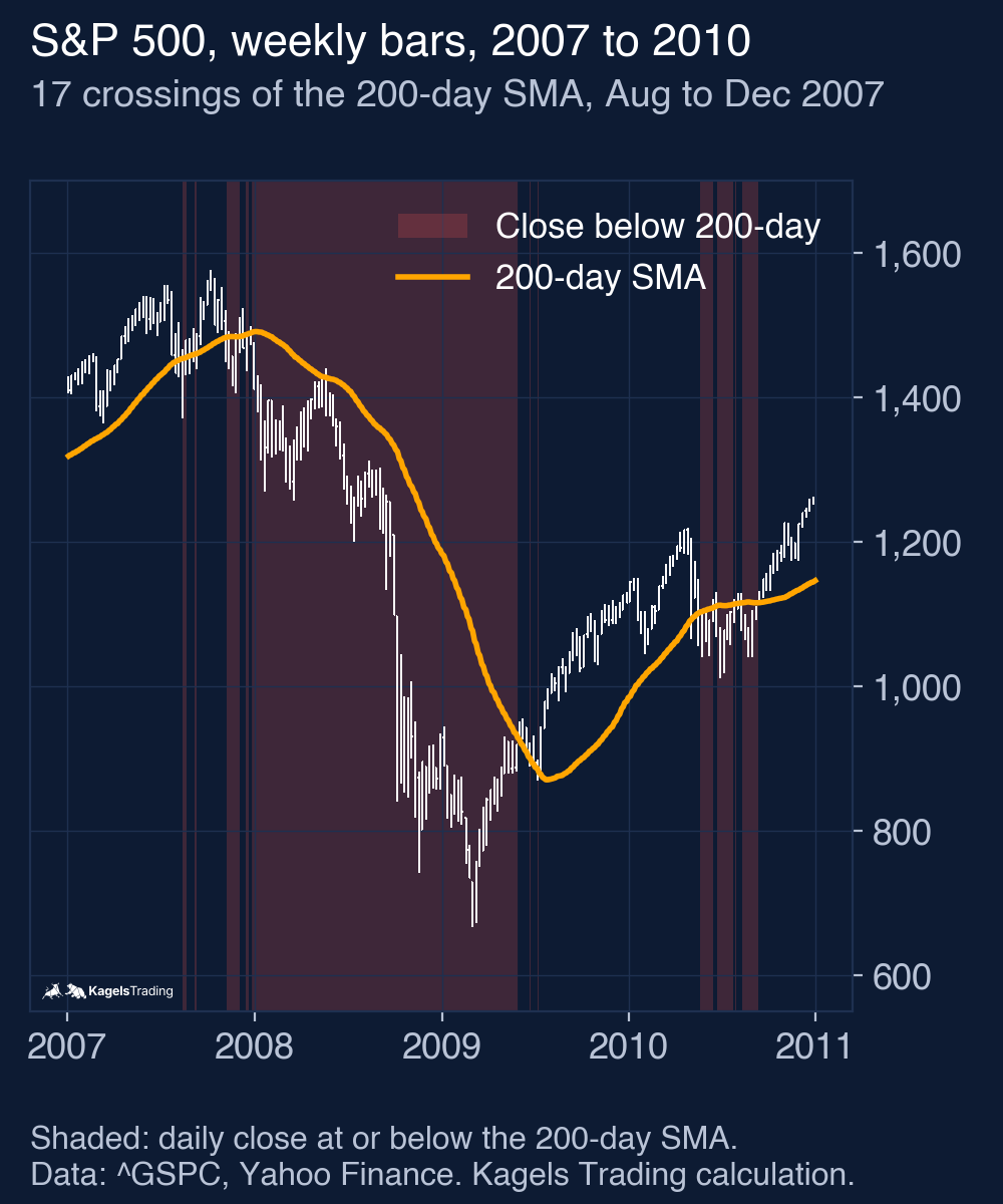
The cost is return and a lot of trading. Over 76 years the filter earned 7.2% a year against 8.2%, and it was ahead of buy and hold at only 32% of all month-ends, the last time at the end of September 2011. It made 224 round trips, and 58% of them lasted less than ten trading days. Those are the whipsaws: the close jumps above the line and falls back days later. The chart above shows 17 crossings between August and December 2007 alone.
The variants did worse, not better. The table shows the two variants I planned before calculating. Neither was chosen after the fact, and neither beat the 200-day SMA.
| Variant (start after warm-up, to Oct 15, 2026) | Return per year | Buy and hold, same period | Largest drawdown | Round trips |
|---|---|---|---|---|
| 200-day SMA (main rule), from Oct 1950 | 7.24% | 8.16% | −24.0% | 224 |
| 200-day EMA, from Oct 1950 | 6.74% | 8.16% | −28.0% | 265 |
| 50-day SMA, from March 1950 | 4.27% | 8.28% | −35.6% | 595 |
An ETF-based check confirms the direction. I ran the same signals on the SPY ETF from 1993 to October 2026, trading at the next real opening price, with an assumed cost of 0.05% per side. Dividends are reinvested at the opening price of the ex-dividend date, an idealised convention. Result: 8.0% a year with a largest drawdown of 27.9%, against 10.8% and 55.2% for buy and hold, with 114 entries. Taxes are not included. In a taxable account, every exit can trigger a tax bill, which makes the filter more expensive.
If you want to see how many lengths you could have tried, the guide to backtesting tests 25 SMA lengths on SPY and shows why the best one in the past is a poor guide to the future. Here the 200-day SMA was the primary rule, with two registered variants. The numbers differ from that guide for known reasons: the signals here come from the S&P 500 index, not from SPY closes, dividends are reinvested at the ex-date open instead of the close, and the periods differ.
Moving average crossovers
A crossover signal uses two averages instead of price and one average. When a faster average crosses above a slower one, traders read it as a buy signal; when it crosses below, as a sell signal. The crossover reacts later than price crossing a single line, but it gives fewer signals.
The best-known crossover is the golden cross, the 50-day average crossing above the 200-day average. I tested it separately on the same S&P 500 data. The golden cross guide shows the 38 signals since 1950 against the base rate and as a trading model. In short: fewer whipsaws than the price filter, the same pattern of lower risk and lower return.
Are moving averages support and resistance?
Many traders treat the 200-day line as support, and the market sometimes reacts there. Because so many people watch it, orders can cluster around it. But a moving average is a calculated line that moves every day. It has no memory of where buyers and sellers actually traded.
I draw my levels from price itself. Highs, lows and congestion zones show where supply and demand met. When a moving average runs into such a zone, the area gets more interesting. On its own, I do not trade a bounce off a calculated line. How to find real zones is shown in the guide to support and resistance.
How to set up a moving average on your chart
Every charting platform has moving averages built in, and three settings matter. The length (for example 50 or 200), the source (normally the close) and the type (SMA, EMA or WMA). Some platforms also offer an offset that shifts the line forward or backward; leave it at zero unless you know why you change it.
Check which type your platform uses by default. If you compare your chart with a news report about the 200-day line, both should use the same type and the same data. A different data feed or a different start for an EMA can move the value slightly.
Advantages and disadvantages of moving averages
Moving averages are simple and useful, but only if you know their limits. The test results above show both sides: lower risk, but lower return.
What speaks for moving averages
- Simple and objective: the line is the same for everyone who uses the same settings.
- Shows direction at a glance: a rising or falling average turns noise into one clear trend.
- Useful as a risk filter: in the model since 1950 the 200-day line cut the largest drawdown from 56.8% to 24.0%.
- Separates calm from wild markets: above the 200-day line, next-month volatility was 10.5% against 14.3% below.
What speaks against moving averages
- Always late: every average is built from past prices, so it turns after the price has turned.
- Many short round trips: 58% of the 200-day filter’s round trips lasted less than ten sessions.
- It cost return: 7.2% instead of 8.2% a year in the model since 1950.
- No volume and no levels: an average ignores where buyers and sellers actually traded.
My conclusion: a good map, a poor trigger
A moving average is a good way to see where the market has been heading, and a poor way to time an entry. The S&P 500 data since 1950 shows that the 200-day line separates calmer, mostly rising phases from wilder ones. Above the line, the index was higher three months later more often, and it swung less.
As a trading rule, the line worked like insurance, and the insurance cost return. It kept the model out of most of the 1973 to 1974 and 2007 to 2009 bear markets: between January 11, 1973 and October 3, 1974 it lost 12.6% against 48.2% for the index, between October 9, 2007 and March 9, 2009 11.2% against 56.8%, but it paid for that with one percentage point of return a year and 130 round trips that lasted less than ten sessions. If you could not sit through a 50% loss, that trade-off can make sense. If you can, the filter mainly costs you return.
This article is market analysis, not investment advice. Past results of an index model do not show future returns.
Frequently asked questions about moving averages
What is a moving average in simple terms?
A moving average is a smoothed line of past closing prices, updated every day; the simple version averages a fixed number of days. It smooths the daily swings so you can see the direction of the trend.
What is the difference between SMA and EMA?
The SMA weights all prices in the window equally, the EMA gives recent prices more weight. That makes the EMA react faster. In the spring of 2025 the 50-day EMA reached its low and started rising eight sessions before the 50-day SMA.
What does the 200-day moving average tell you?
It shows the long-term trend of a market. Since 1950, the S&P 500 closed above its 200-day average on 71.6% of all days. Above the line, the next month was calmer, with a median volatility of 10.5% against 14.3% below it.
Is it bullish when a stock is above its 200-day moving average?
Above the line, the S&P 500 was higher three months later in 70.7% of cases, below it in 56.9%. That is a description of the index, not a guarantee for one stock. Over 12 months, days below the line even had a higher median gain, with much worse bad cases.
Which moving average is best for day trading?
There is no tested best one; short EMAs, such as 9 or 20 periods, are a common choice because they follow the price closely. For a reference price within the session, the VWAP is an alternative: it weights by volume and restarts every day.
How many days is a 50-day moving average?
It covers the last 50 trading days, about ten weeks or a quarter of a year. Weekends and holidays do not count, because there are no closes on those days.
More Technical Indicators guides
- Judge a golden cross
Golden Cross: Definition and S&P 500 Test Results
How the 50-day and 200-day averages cross, and what 38 signals in the S&P 500 since 1950 did against the base rate and buy and hold.
- Read the RSI
RSI Indicator: Formula, Settings and a 75-Year Test
The RSI formula, overbought and oversold, and what RSI signals did on the S&P 500 since 1951 against the base rate.
- Read volatility with Bollinger Bands
Bollinger Bands: Settings, Squeeze and a 76-Year Test
Settings, the three typical chart situations, five strategies with rules, and what the bands and the squeeze showed on the S&P 500 since 1950.
- Set stops with the ATR
ATR Indicator: Average True Range for Stops and Size
True range and Wilder smoothing, stop distance and position size, and how ATR stops behaved on SPY from 1994 to 2026 against a fixed stop.
- Trade Donchian breakouts
Donchian Channel: Breakout Rules and a 20-Year ETF Test
Channel rules, the current-bar pitfall, the Turtle systems, and what 499 breakout trades in SPY, GLD and TLT from 2006 to 2026 showed.
- Read the MACD
MACD Indicator: Histogram, Divergence and a 31-Year Test
Formula, histogram, crossovers and divergences, with a 31-year test on the S&P 500 and the DAX against the base rate.
- Use VWAP
VWAP Indicator: Formula, Anchored VWAP and TradingView Setup
The VWAP formula, trend day versus range day, Anchored VWAP and the right settings in TradingView.