
Golden Cross: Definition and S&P 500 Test Results


Contents
- Golden cross in 30 seconds
- What is a golden cross?
- How a golden cross forms: three phases on the chart
- SMA or EMA: which setting fits the golden cross?
- My test: what 38 golden crosses did since 1950
- Golden cross against buy and hold: the honest comparison
- When the golden cross fails: spotting false signals
- Golden cross and death cross: not mirror images
- How to use the golden cross in your trading
- Advantages and disadvantages of the golden cross
- Golden cross in stocks, crypto and forex
- My conclusion: a good compass, a poor buy signal
- Frequently asked questions about the golden cross
- About the author
Few chart signals get as much attention as the golden cross. When the 50-day average crosses above the 200-day average, the headlines call a new bull market. What is almost always missing is a number that shows what the signal is worth. So I counted every golden cross in the S&P 500 since 1950 and compared the results with an honest benchmark: any trading day in the same period.
The result is less exciting than the headlines and more useful. You will see how the signal forms, what it did after 38 crosses, where it fails and why it works better as a risk filter than as a buy signal. This article follows our editorial policy.
Golden cross in 30 seconds
- Definition: a golden cross forms when the 50-day moving average crosses above the 200-day moving average. It is read as a bullish signal for a new uptrend.
- It is rare: the S&P 500 had 38 golden crosses from 1950 to October 2026, about one every two years.
- It beat the base rate, but not by much: 12 months after a cross the index was higher in 81.6% of cases (31 of 38). After any trading day it was higher in 74.4% of cases.
- It comes late: in the median, the cross came 61 trading days after the lowest close since the previous death cross, and the index was already 13.3% above that close.
- As a trading rule it reduced drawdown, but also return: in a hypothetical model since 1950 it reduced the largest drawdown from 57% to 34%, and earned 7.2% a year instead of 8.2%.
What is a golden cross?
A golden cross is a bullish chart signal that forms when the 50-day moving average of a price crosses above its 200-day moving average.
The golden cross belongs to trend following. Trend following means trading with a trend that is already running instead of trying to call its start or end. The signal does not look into the future. It only states that the price level of the last weeks is now above the price level of the last months. That is the whole difference between a filter and a forecast.
A moving average is the average price over a fixed number of past trading days. It moves forward with every new day and smooths the daily swings, so the main direction becomes visible. The 50-day average shows the medium-term picture, the 200-day average the long-term one.
The opposite signal is called the death cross. It forms when the 50-day average crosses below the 200-day average. How useful that sell signal is, you will see in the section on the death cross further down. The short answer: less than its dramatic name suggests.
How a golden cross forms: three phases on the chart
For the two lines to cross upward, the 50-day average must first have been below the 200-day average. That happens after a downtrend, but also after a deeper correction or a long sideways phase. The cross itself does not confirm that a bottom is in: the rule only compares two averages of past closes.
The 200-day line is the average of the last 200 daily closes. Many traders and investors use it as the main reference for the long-term trend of a stock or an index. When a large index tests it, the financial news reports it.
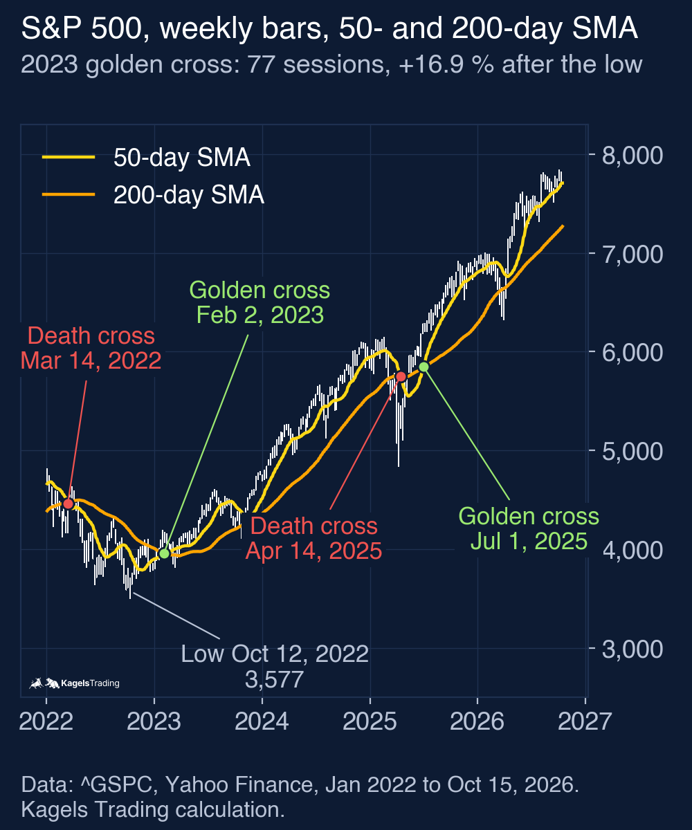
A common sequence has three phases, but it is an illustration, not a rule. First the downtrend loses strength, the price finds a low and the 50-day average turns up. Then the faster line crosses the slower one: that is the actual signal. After that it becomes clear whether the new uptrend lasts or the market falls back into a sideways phase.
 Click to enlarge
This sequence explains the biggest weakness of the signal. By the time the 200-day average has caught up, a large part of the move is over. In the chart above, the S&P 500 made its closing low on October 12, 2022 at 3,577.03 points. The golden cross came on February 2, 2023 at 4,179.76 points: 77 trading days and 16.9% later. Across all 38 signals I measured the distance from the lowest close since the previous death cross: in the median 61 trading days and 13.3%. This window can miss the actual bottom: in 2025 the closing low of April 8 came before the death cross of April 14. If you wait for the cross, you usually miss the first push.
The signal of February 2023 was still a good one. Twelve months later the index was 18.3% higher. The next death cross only came on April 14, 2025, during the April 2025 sell-off, and the next golden cross followed on July 1, 2025. On October 15, 2026 the 50-day average (7,707) was still above the 200-day average (7,268), so that signal is still in force.
SMA or EMA: which setting fits the golden cross?
A simple moving average (SMA) weights every price in the window the same, an exponential moving average (EMA) weights recent prices more. The EMA therefore reacts faster to price moves, the SMA stays slower.
For the golden cross the simple average is the usual choice. The signal is meant to describe the long-term picture, not the last week. My test uses the SMA. As a check I ran the same count with EMAs and report it in the test section, so you can see what the choice changes.
The periods are not set in stone, but two rules matter. Both lines must be slow enough that single trading days do not bend them. And there must be a clear distance between the two settings. A combination of 50 and 200 is the common standard. Two periods close together, such as 180 and 200, cross over small moves and tend to give more signals; I have not tested such pairs here, so treat this as a rule of thumb about noise.
The most important point in practice: stick to one version. If you read SMAs today and EMAs tomorrow, you compare signals that cannot be compared, and afterwards you will always find a setting that would have fitted. That is hindsight, not analysis. The same crossover idea on much shorter EMAs is behind the MACD indicator, which uses 12 and 26 days and therefore crosses far more often.
My test: what 38 golden crosses did since 1950
I took the daily closes of the S&P 500 from January 1950 to October 15, 2026, calculated the 50-day and 200-day simple averages and marked every cross. The data comes from Yahoo Finance. After the 200 days needed to start the averages, the count begins on October 19, 1950. A cross counts on the day the 50-day average closes above the 200-day average after being at or below it the day before. That gave 38 golden crosses and 38 death crosses.
I wrote down these rules before I looked at any result. That matters, because with enough variants (other periods, other markets, other horizons) you can always find a version that looks good. Two variants were planned in advance and both are reported below: EMAs instead of SMAs, and a trade without delay. Nothing else was tested.
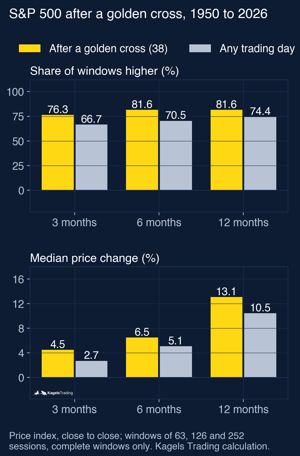
The key is the benchmark. A hit rate of 81.6% sounds impressive, but on its own it says little. Stock indices rise over the long run, so even a completely random entry wins more often than it loses. The base rate is the result of buying on any trading day in the same period, and every signal has to beat it.
 Click to enlarge
| Window after the signal | Golden cross (38) | Any trading day |
|---|---|---|
| 3 months, share higher | 76.3% (29 of 38) | 66.7% |
| 6 months, share higher | 81.6% (31 of 38) | 70.5% |
| 12 months, share higher | 81.6% (31 of 38) | 74.4% |
| 12 months, average change | +11.1% | +9.3% |
| 12 months, median change | +13.1% | +10.5% |
| 12 months, worst case | −29.7% | −48.8% |
The signal was ahead on every horizon, but the lead is small. After 12 months the median result was 13.1% against 10.5% for any day, and the share of positive windows was 81.6% against 74.4%. The windows are 63, 126 and 252 trading days long and count from the signal close. Only complete windows count; the latest cross of July 1, 2025 already has a full 12-month window. The index is a price index without dividends, so all numbers are price changes.
Read these numbers with care. 38 signals are a small sample. About seven percentage points more positive windows can come from chance alone, and the windows of the base rate overlap, so they are not independent observations. What the test shows is a description of the past: after a golden cross, the S&P 500 did a little better than after an average day. It is not proof of an edge you can rely on.
The bad cases are real. Seven of the 38 signals were followed by a lower index 12 months later. The worst came on May 27, 1969: twelve months later the S&P 500 was 29.7% lower. The cross of April 1, 2019 was followed by the Covid crash and a 9.9% loss after one year. The best one, December 21, 1953, was followed by a gain of 41.8%.
The EMA variant looked better in the event count. With 50-day and 200-day EMAs there were also 38 golden crosses, and 12 months later the index was higher in 89.5% of cases (median +15.1%). I report it because I tested it, not because it is the better rule: as a trading model it did slightly worse than the SMA version (7.15% instead of 7.21% a year). One good number in one variant is exactly the kind of result that misleads if you pick it after the fact.
Both planned variants change the trading model only a little. The table shows the main rule next to the two variants. The version without delay trades at the close of the signal day itself. That price is only known when the market has closed, so this is a timing sensitivity calculation, not a strategy this test shows you could execute.
| Variant, October 1950 to October 2026 | Return per year | Largest drawdown | Final value of 100 |
|---|---|---|---|
| SMA 50/200, trade one session later (main rule) | 7.21% | −33.9% | 19,800 |
| EMA 50/200, trade one session later | 7.15% | −33.2% | 19,000 |
| SMA 50/200, trade at the signal close | 7.37% | −33.9% | 22,200 |
| Buy and hold | 8.16% | −56.8% | 38,800 |
Golden cross against buy and hold: the honest comparison
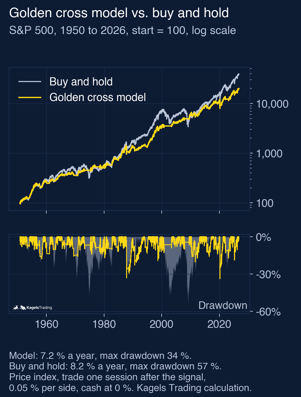
Statistics on single signals are one thing; trading the signal is another. The practical question is: what happens if you buy at every golden cross and sell at every death cross, over 76 years and without exception? I calculated this as a hypothetical index model. An index is not a product you can buy, so read it as a model, not as a track record.
The rules of the model: the signal is known at the close. Because the S&P 500 index has no reliable opening prices before 2006 in this data, the model trades at the close of the next trading day. Each trade costs 0.05%. Cash out of the market earns nothing. Buy and hold uses the same price index and the same cost for its one purchase. The open position at the end is included in the equity curve.
 Click to enlarge
| October 1950 to October 2026 | Golden cross model | Buy and hold |
|---|---|---|
| Return per year | 7.2% | 8.2% |
| Largest drawdown | −33.9% | −56.8% |
| Volatility per year | 11.8% | 15.8% |
| Time in the market | 72% | 100% |
| Final value of 100 | 19,800 | 38,800 |
The result is clear, just not in the way the headlines suggest. The model lost on return: 7.2% against 8.2% a year. Over 76 years that halves the final value. The golden cross model was ahead of buy and hold at only 12.7% of all month-ends, and the last month-end it was ahead was September 2011.
It won on risk. The largest drawdown (the biggest loss from a high to the following low of the equity curve) fell from 56.8% to 33.9%, and the yearly volatility fell from 15.8% to 11.8%. In the crash of 2007 to 2009 the model was out of the market after the death cross of December 21, 2007, and lost 4.4% from the October 2007 high to the March 2009 low, while the index lost 56.8%. In March 2020 it was not: the crash came too fast for a 200-day average, and the model’s own worst drawdown happened then.
An ETF-based model check confirms the picture. I ran the same signals on the SPY ETF from 1993 to October 2026, trading at the next real opening price with an assumed cost of 0.05% per side. Dividends are reinvested at the opening price of the ex-dividend date, an idealised convention: the cash is really paid later. Result: 9.8% a year with a largest drawdown of 33.7%, against 10.8% and 55.2% for buy and hold with the same conventions. Taxes and other real-world differences are not included, and the 16 entries would cost more in a taxable account. Interest on the cash would help the model, because it was out of the market about a quarter of the time.
So the role of the signal is clear: the golden cross is a risk filter, not a return booster. It buys you calmer markets and pays for them with return. Whether that trade works for you depends on one question: could you sit through a drawdown of more than 50% without selling at the wrong time? The guide to risk management shows how to size that risk before it happens.
When the golden cross fails: spotting false signals
A false signal, often called a whipsaw, is a buy signal followed soon by the opposite signal, without the expected trend.
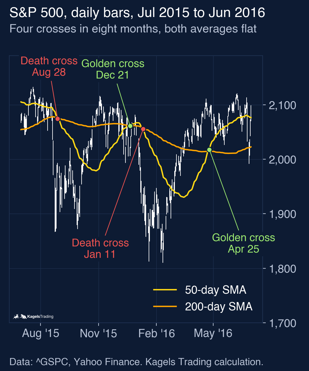
The winter of 2015 is the textbook case. On December 21, 2015 the 50-day average crossed above the 200-day average at a close of 2,021.15 points. Three weeks later, on January 11, 2016, the death cross followed at 1,923.67 points: 4.8% lower between the two signal closes. In the model with its one-day delay and costs, the round trip lost 5.0%.
 Click to enlarge
The chart also shows the cause. For months the two lines run close together and almost flat. In such a phase a normal correction is enough to trigger a signal. The golden cross needs a trend, and a sideways market has none.
Two warning signs follow from this. First: if both averages are almost at the same level and flat when they cross, the signal means little. Second: if crosses in both directions repeat at a similar price level, the market is in a consolidation. In my count, 4 of the 38 golden crosses were reversed by a death cross within 63 trading days: December 1959, May 1969, January 1977 and December 2015.
The worst signals all fell into weak markets. The cross of May 1969 came in the middle of the bear market from late 1968 to 1970. At the moment of the signal it looked just as convincing as the good ones. A crossover does not know in which market it appears.
Golden cross and death cross: not mirror images
The two signals are usually treated as mirror images: one buys, the other sells. The S&P 500 data does not fully support that, at least not over 12 months.
A death cross forms when the 50-day average crosses below the 200-day average, and it is read as a warning of a new downtrend.
I ran the same count for the 38 death crosses. In the first months after a death cross, the S&P 500 did worse than after an average day: after six months it was higher in only 55.3% of cases (21 of 38; base rate 70.5%), with a median change of +1.9% against +5.1%. After 12 months the difference was almost gone: higher in 71.1% of cases (27 of 38) against 74.4%, median +10.5% against +10.5%.
That fits the lag of the signal. By the time the 50-day average falls below the 200-day average, much of the decline is often over. If you sell at a death cross, you sometimes sell into exhaustion: after the death cross of March 30, 2020, the index was 50.7% higher one year later. As an exit in a trend-following system with a fixed rule, it did its job in 2008. As a crash warning or a reason to sell short, the numbers do not support it.
How to use the golden cross in your trading
I do not trade crossover signals myself. I trade price action: what bars, highs and lows show directly on the chart. From that distance it is easy to say what the golden cross is good for and what not, because I have no system to defend.
Its value lies in context, not in the entry. The signal answers one question: in which market phase are you? If the 50-day average is above the 200-day average and the two lines move apart, the uptrend is intact. If they wind around each other, the market is sideways, and trend following does not work there.
In my practice the entry belongs on a smaller time frame. Once the big picture is bullish, I look for pullbacks and let price show me when buyers return, for example at a former resistance zone. How to find such zones is shown in the guide to support and resistance. This is my approach, not a tested rule: the test in this article only compares the crossover with buy and hold. The point where two calculated lines cross says nothing about the current price structure.
Three rules have proved useful when you work with moving averages as a filter. They keep the signal in its role as context and leave the entry to price:
- Do not trade the cross itself. Use it as a filter for the direction and find the entry with price action in a pullback.
- Do not treat averages as support. Waiting for the bounce off the 200-day line means trading a calculated line instead of real supply and demand zones.
- Watch the distance between the lines. A growing gap shows momentum, a shrinking gap points to a sideways phase or a change of trend.
A golden cross does not replace risk management. No matter how convincing the signal looks, position size and stop loss decide the result. Measured between signal closes, 9 of the 37 completed rounds from golden cross to death cross ended lower, the worst with −10.1% (June to September 1957). The position sizing guide shows how to limit what one trade can cost.
If you want to find golden crosses in single stocks, a screener does the work for you. The TradingView screener can filter for stocks whose 50-day average is above the 200-day average.
Advantages and disadvantages of the golden cross
The data and the practical use give a clear picture. The signal has real strengths, but also weaknesses that no setting can remove.
What speaks for the golden cross
- Clear and rule-based: there is no room for interpretation. The lines cross or they do not.
- Lower risk as a trading rule: largest drawdown 33.9% instead of 56.8% in the model since 1950.
- Slightly better than the base rate: 81.6% positive 12-month windows against 74.4% after any day.
- Few quick failures: only 4 of 38 signals were reversed within 63 trading days.
- A market phase filter: it shows whether trend following makes sense right now.
What speaks against the golden cross
- Late by design: in the median 61 trading days after the lowest close since the previous death cross, with the index already 13.3% higher.
- It cost return: 7.2% instead of 8.2% a year in the model since 1950.
- Useless in a sideways market: without a trend the two lines produce signal after signal.
- Small sample: 38 signals in 76 years are not enough to prove an edge.
- It invites overconfidence: the media attention suggests a certainty the numbers do not support.
Golden cross in stocks, crypto and forex
The calculation works on every market and every time frame. Whether it makes sense depends on how the market moves: in long trends or in ranges.
Stock indices suit the signal best. They have a long-term upward drift, move in extended trends and swing moderately. A 50/200 filter is built for exactly that, and the numbers in this article come from such an index. With single stocks it gets less clear: one profit warning overrides any moving average.
In cryptocurrencies the golden cross is quoted often, but in my judgement it helps less than in stock indices. Bitcoin moves in cycles with extreme swings, and by the time the 200-day average reacts, a large part of the move is over. I have not tested crypto here, so this is my judgement from experience, not a measured result.
In forex the long-term upward drift is missing completely. Currency pairs often swing in ranges for years, and in my experience a trend filter there produces more false signals. I have not tested forex here either, so this is judgement, not a measured result. Our S&P 500 forecast shows how I read the index with price levels instead.
My conclusion: a good compass, a poor buy signal
After 38 signals in 76 years my verdict is sober. The golden cross is not a myth, but it is far from what the headlines make of it. After a cross the S&P 500 was higher a bit more often than after any day, and the median gain was a little larger. With 38 cases that is a description, not a reliable edge.
Its real value lies elsewhere. As a trading rule it cut the largest drawdown from 57% to 34% and lowered the swings, but it cost one percentage point of return a year. That is a trade-off, not a free advantage. If you sleep badly when your account is 50% under water, you get a useful tool here. If you can sit through it anyway, you give up return.
For me as a price action trader the cross has another job: it tells me whether trend following makes sense in this market right now. I look for the entry elsewhere, where price itself shows that buyers are back. A signal that comes in the median 61 trading days after the lowest close since the previous death cross is simply the wrong tool for an entry. If you want to test such a rule yourself, the guide to backtesting shows how to do it without fooling yourself.
This article is market analysis, not investment advice. Past results of an index model do not show future returns.
Frequently asked questions about the golden cross
What is a golden cross?
A golden cross is a bullish chart signal. It forms when the 50-day moving average of a price crosses above its 200-day moving average. Traders read it as a sign of a new uptrend.
How reliable is a golden cross?
In the S&P 500 since 1950, the index was higher 12 months after a golden cross in 81.6% of cases. After any trading day it was higher in 74.4% of cases. The lead is real but small, and with only 38 signals it is not proof of an edge.
How often does a golden cross happen?
The S&P 500 formed 38 golden crosses from 1950 to October 2026, about one every two years. In single stocks and on shorter time frames they happen more often, but they say less.
Should you buy when a golden cross happens?
Not on the signal itself. In the median, the golden cross came 61 trading days after the lowest close since the previous death cross, with the index already 13.3% higher. I use it as a filter for the direction; whether an entry in a pullback does better is my practice, not something this test measured.
What is the difference between a golden cross and a death cross?
In a golden cross the 50-day average crosses above the 200-day average, in a death cross it crosses below. In the S&P 500 they did not act as mirror images: after a death cross the next six months were weaker than average, but after 12 months the index was higher in 71.1% of cases (27 of 38).
Does the golden cross work for Bitcoin?
The calculation works, but the signal says less. Cryptocurrencies move in cycles with very large swings, so the 200-day average reacts especially late. I have not tested Bitcoin here, so treat a crypto golden cross with caution.
Should you use SMA or EMA for the golden cross?
The simple moving average (SMA) is the usual choice. In my test the EMA version gave more positive 12-month windows but a slightly weaker trading model. More important than the choice is to stay with one version for good.
This English edition is based on our German edition on kagels-trading.de and has been adapted for international readers.
More Technical Indicators guides
- Use moving averages
Moving Averages: SMA, EMA and a 76-Year 200-Day Test
SMA, EMA and WMA formulas with a worked example, common periods, and what the 200-day line showed on the S&P 500 since 1950.
- Read the RSI
RSI Indicator: Formula, Settings and a 75-Year Test
The RSI formula, overbought and oversold, and what RSI signals did on the S&P 500 since 1951 against the base rate.
- Read volatility with Bollinger Bands
Bollinger Bands: Settings, Squeeze and a 76-Year Test
Settings, the three typical chart situations, five strategies with rules, and what the bands and the squeeze showed on the S&P 500 since 1950.
- Set stops with the ATR
ATR Indicator: Average True Range for Stops and Size
True range and Wilder smoothing, stop distance and position size, and how ATR stops behaved on SPY from 1994 to 2026 against a fixed stop.
- Trade Donchian breakouts
Donchian Channel: Breakout Rules and a 20-Year ETF Test
Channel rules, the current-bar pitfall, the Turtle systems, and what 499 breakout trades in SPY, GLD and TLT from 2006 to 2026 showed.
- Read the MACD
MACD Indicator: Histogram, Divergence and a 31-Year Test
Formula, histogram, crossovers and divergences, with a 31-year test on the S&P 500 and the DAX against the base rate.
- Use VWAP
VWAP Indicator: Formula, Anchored VWAP and TradingView Setup
The VWAP formula, trend day versus range day, Anchored VWAP and the right settings in TradingView.