
Death Cross: What 38 S&P 500 Signals Since 1950 Show


Contents
- Death cross in 30 seconds
- What is a death cross?
- How to spot a death cross on the chart
- My test: what 38 death crosses did since 1950
- Death cross against the base rate: the honest comparison
- Why the death cross always comes late
- Should you short a death cross? A test on SPY
- Death cross in single stocks and other indices
- How to use the death cross sensibly
- Death cross and golden cross: why they are not mirror images
- Setting up the death cross in TradingView
- Advantages and disadvantages of the death cross
- My conclusion: a warning light, not an emergency brake
- Frequently asked questions about the death cross
- About the author
Hardly any chart signal has a more dramatic name than the death cross. When the 50-day average falls below the 200-day average, the headlines follow within hours and the next bear market is announced. What those headlines almost never contain is a number that shows how often a deep decline actually followed.
For this article I counted all 38 death crosses the S&P 500 has formed since 1950. I measured how deep the index fell before the next golden cross, how late the signal came, and how the following months compared with any trading day. I also tested what selling short at every death cross on SPY would have done since 1993, and ran the same count on the Nasdaq, the Russell 2000, NVIDIA and Bitcoin. This article follows our editorial policy.
Death cross in 30 seconds
- Definition: a death cross forms when the 50-day moving average crosses below the 200-day moving average. It is read as a warning of a downtrend.
- Rare: the S&P 500 formed 38 death crosses from October 1950 to October 2026, about one every two years.
- Rarely a crash: only 6 of 38 were followed by a decline of 20% or more before the next golden cross. The median decline was 6.3%.
- Late: on the day of the cross the index was already 8.4% below its 12-month high in the median, and that high was 64 trading days back.
- A short-term warning, not a short signal: one month later the index was higher in 47.4% of cases against 61.7% for any day; after 12 months the gap was small (71.1% against 74.4%). Shorting SPY at every death cross lost money in 12 of 15 trades since 1993.
What is a death cross?
A death cross is a bearish chart signal that forms when the 50-day moving average of a price crosses below its 200-day moving average.
The name comes from the financial press, not from the textbooks. It describes the picture on the chart: two lines run towards each other and cross, and the short-term line ends up below the long-term line. Technically it is a trend filter built from two moving averages, and it is the opposite of the golden cross.
The 50 and 200 days are a convention, not a law of nature. They became the standard because 50 trading days are roughly a quarter and 200 roughly a trading year. If you choose other lengths, you get other signals, and none of the numbers in this article apply to them. How the two averages are calculated and how SMA and EMA differ is explained in the guide to moving averages.
The smoothing explains everything the death cross can and cannot do. An average turns many closes into one line, so it filters out daily noise and shows the trend. The same smoothing means the line always follows price with a delay. A moving average cannot forecast; it can only summarise what has already happened.
How to spot a death cross on the chart
You need no special software, only two standard lines on the same time frame. The classic death cross is a signal on the daily chart. On an hourly chart the same crosses happen far more often, and they mean something different.
- Two averages: a 50-day and a 200-day simple moving average, both calculated on closing prices. Give them different colours.
- The cross: when the 50-day line falls below the 200-day line, the death cross is there. The reverse is the golden cross.
- The close: during the session the lines can cross and cross back before the close. Count only crosses at the close, otherwise you count signals that never existed.
A common question is whether to use the SMA or the EMA. The simple moving average is the usual choice and the one I tested. An exponential average reacts faster and therefore produces more crosses. Staying with one setting for good matters more than which one you pick.
My test: what 38 death crosses did since 1950
I calculated the 50-day and 200-day simple averages of the S&P 500 from daily closes since January 1950 and marked every cross. The data comes from Yahoo Finance and ends on October 15, 2026. After the 200 days needed to start the averages, the count begins on October 19, 1950. A death cross counts on the day the 50-day average closes below the 200-day average after being at or above it the day before. I wrote these rules down before calculating anything; the full specification is the same as for my golden cross test.
The first question is how far the index fell after the signal. I took the lowest close between each death cross and the next golden cross. All 38 signals have been ended by a golden cross, so all of them count.
| Decline after the death cross (until the next golden cross) | Cases | Share |
|---|---|---|
| Less than 10% | 27 of 38 | 71% |
| 10% to less than 20% | 5 of 38 | 13% |
| 20% or more | 6 of 38 | 16% |
The typical case was a dip, not a crash. The median decline was 6.3%, the mean 10.2%. That the mean is much higher than the median is a finding in itself: a few severe cases pull it up.
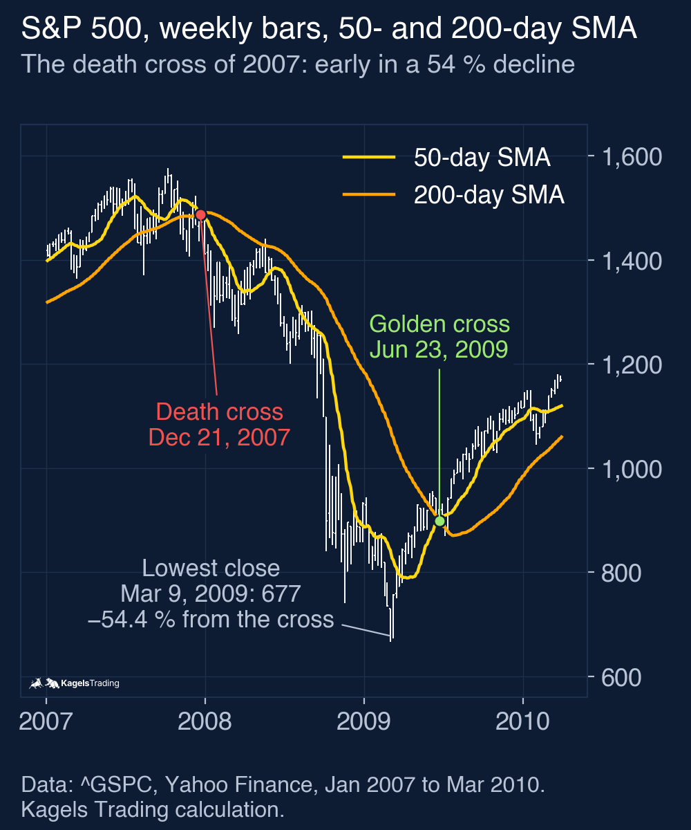
The six severe cases are well-known names in market history. They explain why the signal has kept its reputation: when it was right, it was right in a big way. The table shows the close-to-close change from the day of the cross to the lowest close before the next golden cross, and the change after 12 months (252 sessions).
| Death cross | Decline until the next golden cross | Change after 12 months |
|---|---|---|
| May 7, 1962 | −20.8% | +5.2% |
| June 23, 1969 | −28.0% | −20.4% |
| April 18, 1973 | −44.2% | −15.0% |
| July 2, 1981 | −20.4% | −15.5% |
| October 30, 2000 | −44.5% | −21.2% |
| December 21, 2007 | −54.4% | −41.3% |
 Click to enlarge
Four of the six severe cases came before 1982. Since January 1982 the index formed 20 more death crosses, and exactly two of them led to a decline of 20% or more: the end of the dot-com bubble in October 2000 and the financial crisis after December 2007. If you see a death cross today and think of 2008, you are thinking of two cases out of twenty.
Death cross against the base rate: the honest comparison
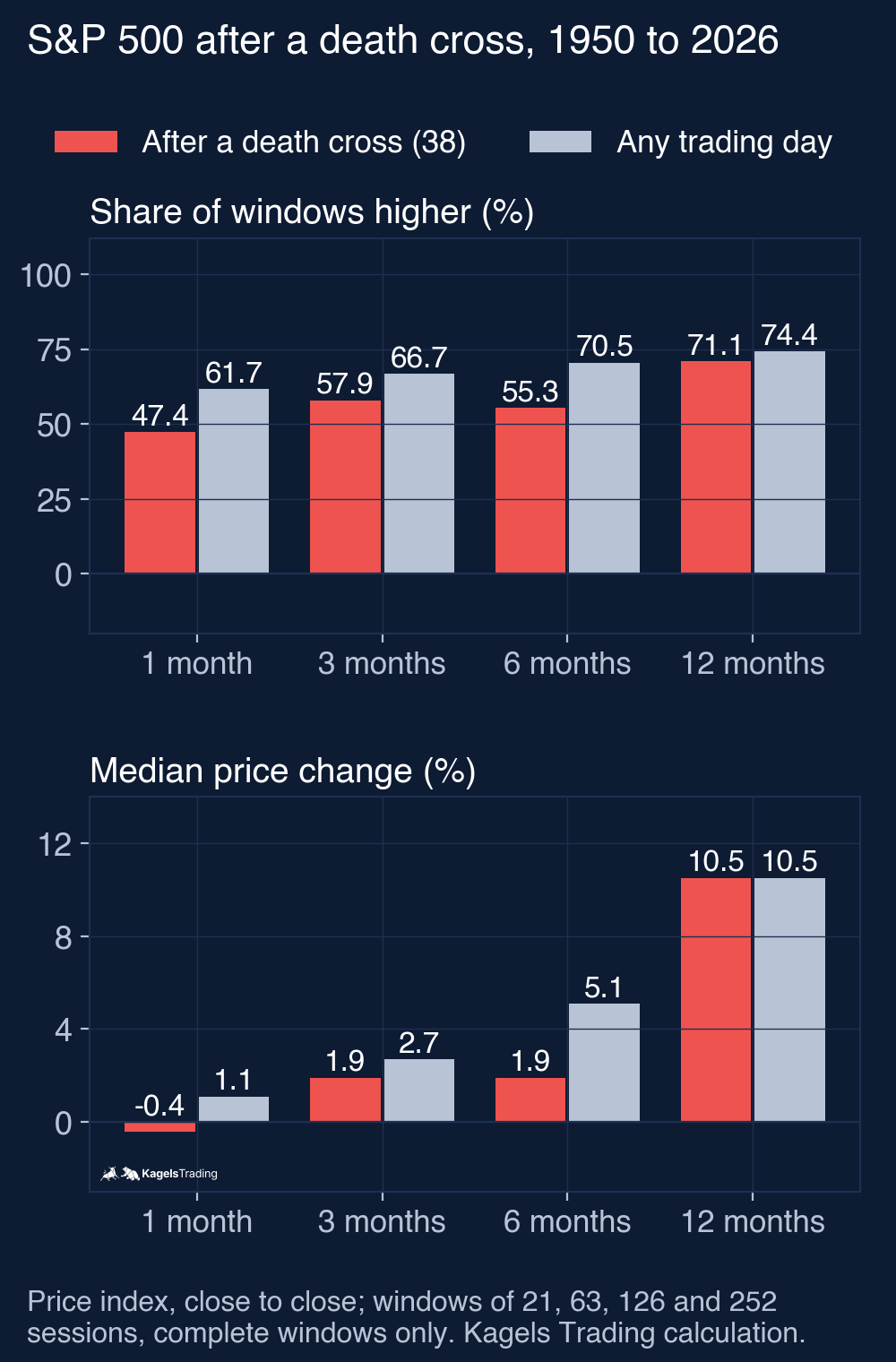
A hit rate on its own says little, because stock indices rise over the long run. Almost any statistic about stocks looks good over a year. The only fair question is whether the months after a death cross were worse than the months after any other day. That comparison number is called the base rate: I repeated the same calculation for every eligible trading day of the same period, with the same horizons and only complete windows.
 Click to enlarge
| S&P 500, 1950 to 2026 | 1 month | 3 months | 6 months | 12 months |
|---|---|---|---|---|
| Higher after a death cross | 47.4% (18 of 38) | 57.9% (22 of 38) | 55.3% (21 of 38) | 71.1% (27 of 38) |
| Higher after any day | 61.7% | 66.7% | 70.5% | 74.4% |
| Median change after a death cross | −0.4% | +1.9% | +1.9% | +10.5% |
| Median change after any day | +1.1% | +2.7% | +5.1% | +10.5% |
Over one to six months, the S&P 500 was higher less often after a death cross than after an average day. After one month it was higher in 47.4% of cases against 61.7%, after six months in 55.3% against 70.5%. With only 38 signals and overlapping base-rate windows these numbers are descriptive, not proof, but the gap is consistent across the first three horizons.
After 12 months the difference had almost disappeared. The index was higher in 71.1% of cases against 74.4% for any day, and the median change was the same, +10.5%. Split in two periods, the picture changes again: from 1950 to 1981 the index was higher a year after a death cross in only 55.6% of cases (10 of 18; any day 66.3%), from 1982 to 2026 in 85.0% (17 of 20; any day 80.1%). In the more recent period, the index was higher a year after a death cross at least as often as after any day.
Both popular camps are wrong. If you sell the death cross as a herald of the bear market, you ignore that 32 of 38 signals were not followed by a further decline of 20% or more. If you call it a myth, you ignore the weaker first months. In this sample it was a short-term warning with a limited shelf life.
Why the death cross always comes late
Every textbook says that moving averages lag; few say by how much. For each of the 38 crosses I measured where the index stood on the day of the signal compared with its highest close over the previous 252 sessions plus the signal day.
In the median, the S&P 500 was already 8.4% below that high, and the high was 64 trading days back. About three months and close to a tenth of the price were gone before the signal appeared. If you sell at a death cross, you do not sell at the top; you sell after the first part of the move. That is the price of the smoothing.
 Click to enlarge
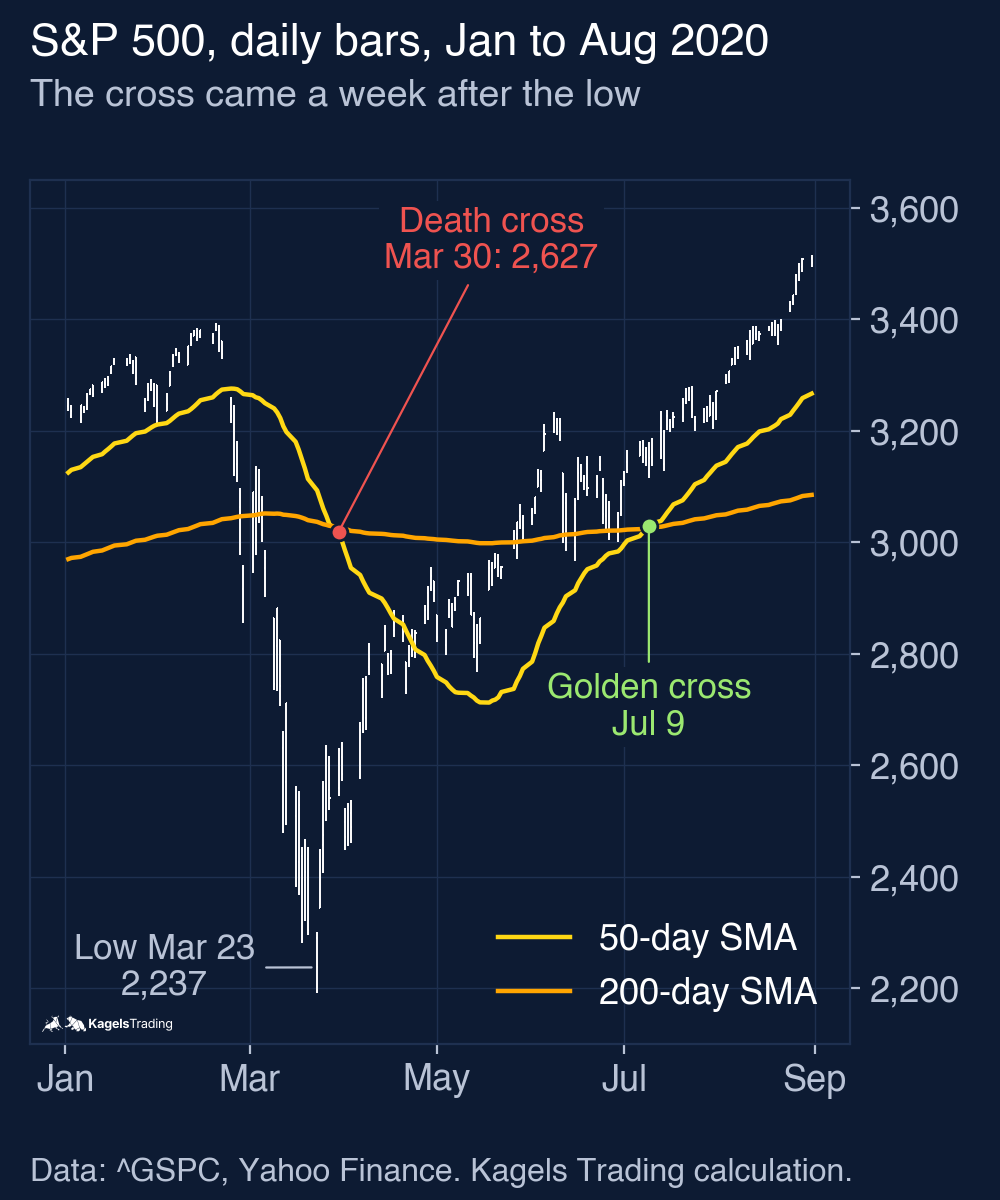
The year 2020 is the extreme example. The index made its closing low on March 23, 2020; the death cross came a week later, on March 30, when the index was already 22.4% below its February high. From there the index fell at most another 5.9%, and a year later it was 50.7% higher. A seller at the signal sold into the end of the decline.
The severe cases look different, and that is the real case for the signal. For the six severe cases I calculated which share of the decline was already over on the day of the cross, measured from the highest close of the previous 252 sessions plus the signal day to the lowest close before the next golden cross. In the two largest it was the smallest share: 17% before the 2000 to 2002 decline and only 9% before the financial crisis. Long declines take time, so a slow signal can still come early enough. An indicator that is mostly a nuisance and rarely a rescue can still be useful if the rare case is expensive enough.
Should you short a death cross? A test on SPY
The obvious trading idea is to sell short at the death cross and buy back at the next golden cross. I tested exactly that as a hypothetical model on SPY, the ETF that tracks the S&P 500, from its launch in 1993 to October 15, 2026. The signals come from the S&P 500 close; the trade happens at the next SPY open, because the index itself has no usable opening prices before 2006.
- Entry: short SPY at the next open after a death cross close.
- Exit: buy back at the next open after the following golden cross close.
- Costs: 0.05% per side. A short seller pays the dividends that fall into the holding period, so they are deducted. No borrowing fee, no interest on cash.
| Short SPY from death cross to golden cross, 1993 to 2026 | Result |
|---|---|
| Completed trades | 15 |
| Winning trades | 3 |
| Mean / median trade | −3.5% / −7.3% |
| Best trade | +36.8% (December 24, 2007 to June 24, 2009) |
| Worst trade | −21.3% (March 31 to July 10, 2020) |
| Sum of all trades (not compounded) | −52.8 percentage points |
| Median holding period | 77 sessions |
Shorting the death cross lost money in 12 of 15 trades. Only the two great declines paid: +30.0% from October 2000 to May 2003 and +36.8% from December 2007 to June 2009. The third winner, March 2022 to February 2023, made +0.3%. All the others lost between 0.6% and 21.3%, because the index usually recovered before the 200-day average turned. Added up, the 15 trades came to −52.8 percentage points after costs and dividends. This is one model on one market with 15 trades; it describes this sample and is not a forecast.
Using the death cross as an exit is a different matter. Selling at the death cross and buying back at the golden cross, instead of going short, is the long/flat model I tested in the golden cross guide. From 1950 to 2026 it earned less per year than buy and hold, but its largest drawdown was much smaller. The death cross helped as a reason to step aside, not as a reason to bet against the market.
Death cross in single stocks and other indices
The S&P 500 is only one market, so I ran the same count on four others. For each I used daily closes from Yahoo Finance up to October 15, 2026 and the same rules. The comparison column is the base rate of the same market and period.
| Market (data from) | Death crosses | Median decline until the golden cross | 20% or more | Higher after 6 months (any day) | Higher after 12 months (any day) |
|---|---|---|---|---|---|
| S&P 500 (1950) | 38 | −6.3% | 6 | 55.3% (70.5%) | 71.1% (74.4%) |
| Nasdaq Composite (1971) | 33 | −4.6% | 5 | 75.8% (70.2%) | 72.7% (76.2%) |
| Russell 2000 (1987) | 28 | −7.0% | 4 | 67.9% (66.7%) | 82.1% (70.9%) |
| NVIDIA (1999) | 13 | −30.1% | 8 | 61.5% (72.3%) | 69.2% (74.0%) |
| Bitcoin (2014) | 10 | −13.9% | 4 | 126 calendar days: 70.0% (61.7%) | 252 calendar days: 60.0% (73.1%) |
The weak six months after the signal did not repeat in the Nasdaq or the Russell 2000. In both, the index was higher after six months at least as often as on an average day. The lesson is not that the death cross works differently there; it is that 28 to 38 signals per market are too few to call such differences reliable.
A single stock behaves very differently from an index. After its 13 death crosses, NVIDIA fell 30.1% in the median, five times as far as the S&P 500, and 8 of 13 cases reached at least 20%. Yet a year later the stock was higher in 9 of 13 cases. The death cross of March 20, 2025 was followed by a 20.4% decline and then, 252 sessions after the cross, a price 48.2% higher. In a single stock a death cross is often the late echo of one bad piece of news; in a broad index it reflects a move that has hit many companies at once.
Bitcoin shows larger swings in both directions. Bitcoin trades every day, so its windows are 126 and 252 calendar days, about four and eight months. The death cross of November 16, 2025 at about $94,177 was followed by a decline of 37.8%, and only on September 8, 2026 did a golden cross end it. The death cross of April 7, 2025 was the opposite case: the price fell just 3.7% more and the golden cross came on May 22. Larger swings mean larger hits and larger false alarms. For the current picture, see our Bitcoin forecast.
How to use the death cross sensibly
After everything the numbers show, the death cross works better as a filter than as a trigger. It answers the question “what is the bigger picture?”, not the question “should I sell now?”. These are ideas for how to use it, not rules I tested:
- As a direction filter: while a death cross is active, judge long setups more strictly and give short setups more room. The entry still comes from your own setup.
- Never on its own: a month after the signal, the S&P 500 was higher in 47.4% of cases. That is close to a coin toss, so combine it with support and resistance or a momentum tool such as the RSI.
- With a time limit: in my S&P 500 test the weaker months were the first one to six. A death cross from a year ago says little about today.
- Position size before forecast: the most robust use is in risk management. Reducing the size of a position instead of selling everything, or selling short, is a way to respect the warning without betting on it. The guide to position sizing shows how to work out the size.
I do not trade crossover signals myself. As a discretionary price action trader I read the chart through structure, market phases and the behaviour of price at important levels; the guide to price action trading describes that approach. What I value in the death cross is that it cannot be talked into anything: it has no opinion. That is why it is useful as a control question.
Death cross and golden cross: why they are not mirror images
Both signals come from the same two lines; only the direction differs. In a golden cross the 50-day average crosses above the 200-day average, in a death cross it crosses below. But stock indices rise over the long run, so the golden cross works with the main trend and the death cross against it. A sell signal in a rising market has the harder job.
That is visible in the short test above. As an exit from a long position the death cross reduced drawdowns; as a reason to sell short it lost money in most cases. Both signals share the same lag, so the golden cross guide has the matching numbers for the buy side, including how often a golden cross was reversed by a death cross within three months.
Setting up the death cross in TradingView
In TradingView the two lines need no extra script. Two built-in indicators are enough, and the free Basic plan allows two indicators per chart. An alert saves you the daily check, but according to the TradingView plan comparison alerts on indicators start with the paid Essential plan.
- Open the chart: choose the instrument and set the time frame to one day.
- Add the indicator twice: search for “Moving Average Simple” in the indicator list and add it two times.
- Set the lengths: 50 for the first, 200 for the second, both on the close. Give them different colours.
An alert on the cross means you do not have to watch the chart. On a plan with indicator alerts, create an alert on the 50-day average, choose “Crossing Down” as the condition and the 200-day average as the target. Set the trigger to “Once Per Bar Close”; otherwise the alert fires during the session for crosses that disappear by the close. If you want to mark the signals automatically, a short script does it; our guide to Pine Script shows the basics.
Advantages and disadvantages of the death cross
Every point in this list goes back to a number from the tests above. The death cross has real strengths, but most of its weaknesses come from the same source as its strengths: the smoothing of two long averages.
What speaks for the death cross
- Unambiguous: the cross is an objective point on the chart. With the same settings, two traders always see the same signal.
- A measurable short-term effect in the S&P 500: over one to six months, the share of higher windows was 9 to 15 percentage points below the base rate.
- Caught the big ones: before the 2000 to 2002 decline and the financial crisis, only 17% and 9% of the decline from that rolling 12-month high to the following low was over at the signal.
- No effort: two standard lines in any charting program, no extra script, no calculation by hand.
What speaks against the death cross
- Late: in the median the S&P 500 was already 8.4% below a high that was 64 trading days back.
- Rarely followed by a deep decline: only 6 of 38 signals were followed by a further decline of 20% or more before the next golden cross; in 27 the further decline stayed under 10%.
- Short shelf life: after 12 months the share of higher windows was 71.1% against a base rate of 74.4%, and since 1982 it was even higher than the base rate.
- A poor short signal: shorting SPY at every death cross lost money in 12 of 15 trades since 1993.
- Useless in sideways markets: when price runs flat around both lines, crosses come in series and cancel each other out.
My conclusion: a warning light, not an emergency brake
After 38 death crosses in the S&P 500 and 84 more in four other markets, my verdict is clear. The death cross is much less dramatic than its name and more useful than its critics say. In 32 of 38 S&P 500 cases the index did not fall a further 20% or more after the signal, and the median decline from the signal close was only 6.3%. A bear market that is already under way is a different count. The 2020 case is the lesson: the signal came a week after the low.
Against those who dismiss it stand the first months and the two big crises. One to six months after a death cross, the S&P 500 was higher less often than after an average day, and in the two most severe declines of recent decades the signal came early enough to avoid most of the loss.
My recommendation is to treat the death cross as a warning light, not as an emergency brake. It is a reason to check position size, tighten stops and judge long setups more strictly. It is not a reason to sell everything, and in my test it was a poor reason to go short.
This article is market analysis, not investment advice. Past results of a rule test do not show future results.
Frequently asked questions about the death cross
What is a death cross?
A death cross is a bearish chart signal in which the 50-day moving average crosses below the 200-day moving average. It is read as a warning that a downtrend may be starting. The opposite is the golden cross.
How reliable is the death cross?
As a forecast of a deep further decline, not very. Of 38 death crosses in the S&P 500 since 1950, only 6 were followed by a decline of 20% or more before the next golden cross, and 27 stayed under 10%. As a short-term warning it did better: one to six months later, the index was higher less often than after an average day.
Is a death cross a signal to sell?
Not on its own, according to these numbers. One month after the signal, the S&P 500 was higher in 47.4% of cases against 61.7% for any day: a real difference, but close to a coin toss for a single decision. Shorting SPY at every death cross since 1993 lost money in 12 of 15 trades.
How often does a death cross happen?
In the S&P 500, 38 times from October 1950 to October 2026, about once every two years. The Nasdaq Composite had 33 since 1971, the Russell 2000 28 since 1988 and Bitcoin 10 since 2015. Single stocks and shorter time frames produce them more often.
Why does the death cross come so late?
Because moving averages only summarise what has already happened. On the day of the cross, the S&P 500 was in the median already 8.4% below its 12-month high, and that high was 64 trading days back. In 2020 the cross came a week after the low.
Does the death cross work for single stocks and Bitcoin?
The calculation works the same, but the swings are much larger. After NVIDIA’s 13 death crosses the median decline was 30.1%, after Bitcoin’s 10 it was 13.9%, against 6.3% in the S&P 500. Yet a year later NVIDIA was higher in 9 of 13 cases, so a deep decline and a strong year do not exclude each other.
This English edition is based on our German edition on kagels-trading.de and has been adapted for international readers.
More Technical Indicators guides
- Judge a golden cross
Golden Cross: Definition and S&P 500 Test Results
How the 50-day and 200-day averages cross, and what 38 signals in the S&P 500 since 1950 did against the base rate and buy and hold.
- Use moving averages
Moving Averages: SMA, EMA and a 76-Year 200-Day Test
SMA, EMA and WMA formulas with a worked example, common periods, and what the 200-day line showed on the S&P 500 since 1950.
- Trail a stop with the Supertrend
Supertrend Indicator: Settings, Strategies and an ETF Test
How the ATR-based line is calculated, common settings, five strategies, and what 654 completed flip trades in SPY, QQQ and GLD since 1993 showed.
- Read the Ichimoku Cloud
Ichimoku Cloud: The Five Lines and a US ETF Test
The five lines and the cloud, how traders read the Tenkan/Kijun cross, and what the cloud and the crosses did in SPY (since 1993), QQQ and GLD.
- Measure trend strength with the ADX
ADX Indicator: What Trend Strength Really Tells You
How +DI, −DI and the ADX are calculated, what 20 and 25 mean, and whether a high ADX meant the trend went on in SPY, QQQ and GLD.
- Read the RSI
RSI Indicator: Formula, Settings and a 75-Year Test
The RSI formula, overbought and oversold, and what RSI signals did on the S&P 500 since 1951 against the base rate.
- Read volatility with Bollinger Bands
Bollinger Bands: Settings, Squeeze and a 76-Year Test
Settings, the three typical chart situations, five strategies with rules, and what the bands and the squeeze showed on the S&P 500 since 1950.
- Set stops with the ATR
ATR Indicator: Average True Range for Stops and Size
True range and Wilder smoothing, stop distance and position size, and how ATR stops behaved on SPY from 1994 to 2026 against a fixed stop.
- Trade Donchian breakouts
Donchian Channel: Breakout Rules and a 20-Year ETF Test
Channel rules, the current-bar pitfall, the Turtle systems, and what 499 breakout trades in SPY, GLD and TLT from 2006 to 2026 showed.
- Read the Stochastic
Stochastic Oscillator: Settings, Signals and a 30-Year Test
The %K and %D formula, what 14, 3, 3 means, fast versus slow, and what 785 oversold signals in SPY, QQQ and GLD did against the base rate.
- Judge a divergence
Divergence Trading: Regular and Hidden Divergence Tested
Regular and hidden, bullish and bearish divergences, when they are confirmed, and what 447 RSI divergences detected in SPY, QQQ and GLD did against the base rate.
- Read the MACD
MACD Indicator: Histogram, Divergence and a 31-Year Test
Formula, histogram, crossovers and divergences, with a 31-year test on the S&P 500 and the DAX against the base rate.
- Use VWAP
VWAP Indicator: Formula, Anchored VWAP and TradingView Setup
The VWAP formula, trend day versus range day, Anchored VWAP and the right settings in TradingView.