
Ichimoku Cloud: The Five Lines and a US ETF Test


Contents
- Ichimoku Cloud in 30 seconds
- What is the Ichimoku Cloud?
- The five lines and how they are calculated
- How traders read the Ichimoku Cloud
- My test: the cloud and the Tenkan/Kijun cross on SPY, QQQ and GLD
- How to use the Ichimoku Cloud sensibly
- Ichimoku compared with moving averages and the Supertrend
- Ichimoku in TradingView
- Advantages and disadvantages of the Ichimoku Cloud
- My conclusion: a rich map, not a signal generator
- Frequently asked questions about the Ichimoku Cloud
- About the author
The Ichimoku Cloud looks like the most complicated indicator on any chart, and at first glance it is. Five lines, a shaded cloud and two of the lines shifted in time make a busy picture. Behind it are a few simple ideas: the middle of a range, measured over three lengths, and a time shift that puts some of it ahead of price.
This guide explains each line, what traders read from the cloud and the crosses, and then tests the two most common rules. I measured them on three US ETFs, SPY for the S&P 500 since 1993, QQQ for the Nasdaq 100 and GLD for gold, against the base rate of any trading day. The result is more modest than most descriptions of the cloud suggest. This article follows our editorial policy.
Ichimoku Cloud in 30 seconds
- What it is: a Japanese charting system with five lines that show trend, support and resistance and momentum in one picture. The full name is Ichimoku Kinko Hyo.
- Settings 9, 26, 52: the conversion line uses 9 periods, the base line 26, the slow span of the cloud 52, and the cloud is shifted 26 periods ahead.
- Above the cloud is the usual bullish reading: in my test SPY closed above the cloud on 66.1% of all days since November 1993, and the next 20 sessions were higher only slightly more often than on any day (62.4% against 61.2% across three ETFs).
- The “strong” crosses were not stronger: bullish Tenkan/Kijun crosses with the cross point above the cloud were followed by a higher price in 56.4% of cases, against 61.2% for any day and 61.9% for “weak” crosses below the cloud.
- As a long-only filter it cut drawdowns and returns: staying long only above the cloud earned 3.4% a year in SPY against 8.9% for buy and hold, with a largest drawdown of 37.2% against 56.5%.
What is the Ichimoku Cloud?
The Ichimoku Cloud (Ichimoku Kinko Hyo) is a technical analysis system that combines five lines, built from the midpoints of past price ranges, into one picture of trend, support and resistance and momentum.
The name means roughly “equilibrium chart at one glance”. The idea is that you should be able to see the state of a market at a single look: which way it is going, where its support lies and how strong the move is. The cloud, kumo in Japanese, is the shaded area between two of the lines and the part most traders look at first.
It was developed by the Japanese journalist Goichi Hosoda. According to the TradingView help on the Ichimoku Cloud, it was introduced in the late 1960s, and its adoption took several years. Outside Japan it became widely known only much later, when charting software made the five lines easy to draw.
Unlike most indicators, Ichimoku does not average closing prices. Three of the five lines are the middle of a high-low range, the highest high plus the lowest low divided by two; Leading Span A averages two of them, and the lagging span is the shifted close. That makes it a cousin of the Donchian Channel, whose middle line is the same calculation. The difference is that Ichimoku uses three different lengths and shifts some lines in time.
The five lines and how they are calculated
Each line answers a simple question about the recent range. The standard settings are 9, 26 and 52 periods. A common explanation links them to a six-day trading week in Japan (9 a week and a half, 26 a month, 52 two months); I could not verify it at a primary source. Whatever their origin, they are the usual defaults on charting platforms today, and the ones I tested.
| Line | Japanese name | Calculation (standard settings) | Plotted |
|---|---|---|---|
| Conversion line | Tenkan-sen | (highest high + lowest low of the last 9 periods) ÷ 2 | at the current bar |
| Base line | Kijun-sen | (highest high + lowest low of the last 26 periods) ÷ 2 | at the current bar |
| Leading Span A | Senkou Span A | (conversion line + base line) ÷ 2 | 26 periods ahead |
| Leading Span B | Senkou Span B | (highest high + lowest low of the last 52 periods) ÷ 2 | 26 periods ahead |
| Lagging Span | Chikou Span | today’s close | 26 periods back |
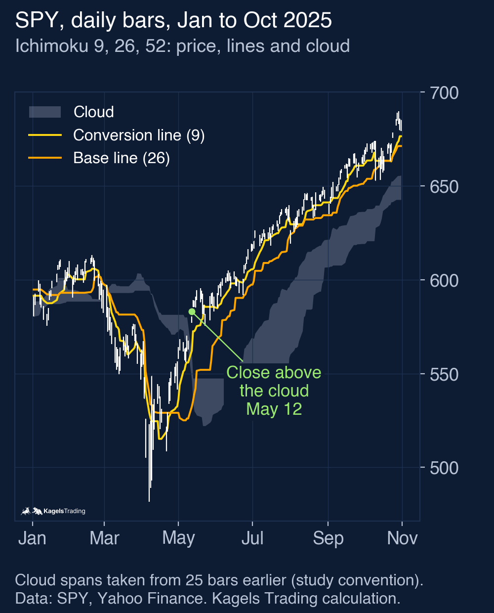
The cloud is the area between Leading Span A and Leading Span B. When Span A is above Span B, the cloud is usually coloured green; when Span B is on top, red. Because both spans are calculated today but drawn 26 periods ahead, the cloud you see above today’s bar was calculated about a month ago, and the cloud on the right of the chart shows today’s values in the future.
This time shift is the source of much confusion. The cloud in the future is not a forecast; it is today’s range midpoints, moved to the right. The lagging span is today’s close moved 26 periods back, so it can be compared with the price of a month ago. Charting tools differ in whether they count the current bar as the first of the 26. My test takes the cloud on each bar from the values of 25 bars earlier, so it never uses information that was not yet known; with 26 bars instead, the shares of days above, inside and below the cloud moved by less than a point, the cross shares by up to 1.3 points and the model returns by up to 0.8 points a year.
 Click to enlarge
How traders read the Ichimoku Cloud
Most Ichimoku readings come down to four questions. They are the textbook rules, the way most guides and the TradingView help describe them. Whether they hold up is the subject of my test further down; here is what each one is supposed to mean.
- Price and the cloud: above the cloud counts as an uptrend, below as a downtrend, inside as no clear trend. The edges of the cloud act as support and resistance, and a thick cloud as stronger support than a thin one.
- The Tenkan/Kijun cross: when the conversion line crosses above the base line, that is a bullish signal, crossing below a bearish one. A bullish cross above the cloud counts as strong, inside as neutral, below as weak; for bearish crosses the other way round.
- The base line as a level: the Kijun-sen is the middle of the last 26 periods. Many traders use it as a trailing stop or as the level for a pullback entry.
- The lagging span: when today’s close is above the price of 26 periods ago, the lagging span is above price, which confirms an uptrend.
A future cloud that changes colour is often read as an early warning. When Span A crosses below Span B on the right side of the chart, the short-term midpoint has fallen below the long-term one. That is a fact about the last weeks, shifted forward; it does not know anything about the next weeks, and I have not tested it as a signal.
My test: the cloud and the Tenkan/Kijun cross on SPY, QQQ and GLD
I wrote the rules down before calculating and applied them unchanged to three ETFs. SPY stands for the S&P 500, QQQ for the Nasdaq 100 and GLD for gold. Data: daily bars from Yahoo Finance up to October 15, 2026, price returns without dividends. The test starts on the first day on which the cloud and a 200-day average both exist: November 11, 1993 for SPY (8,287 trading days), December 21, 1999 for QQQ and September 2, 2005 for GLD.
- Settings: 9, 26, 52, with the cloud on each bar taken from 25 bars earlier (this study’s convention, see above).
- Position: above the cloud means the close is above both spans, below means below both, inside means between them.
- Comparison: every trading day of the same ETF and period, with a 20-session horizon. Only complete windows count, and they overlap, so neighbouring days are not independent observations.
Finding 1: above the cloud is common, and only slightly better
SPY closed above the cloud on two thirds of all days. The share was 66.1% in SPY, 62.2% in QQQ and 51.4% in GLD; inside the cloud it was 11.0%, 12.2% and 14.7%. In rising stock markets, “above the cloud” is the normal state, not a special signal.
| Next 20 sessions higher | SPY | QQQ | GLD | All three |
|---|---|---|---|---|
| Close above the cloud | 64.6% | 63.1% | 56.8% | 62.4% (12,365 days) |
| Close inside the cloud | 62.1% | 63.5% | 51.7% | 59.3% (2,516) |
| Close below the cloud | 63.4% | 58.7% | 56.0% | 59.5% (5,403) |
| Any day | 64.0% | 62.0% | 55.8% | 61.2% (20,284) |
| Median change above / below the cloud | +1.15% / +1.99% | +1.46% / +1.62% | +0.77% / +0.69% |
The cloud separated the next month only by a few points. Across all three ETFs, the next 20 sessions were higher on 62.4% of the days above the cloud and on 59.5% of the days below it, against 61.2% for any day. In SPY the median change after a close below the cloud was even larger (+1.99%) than after a close above it (+1.15%): many days below the cloud came after sharp declines, which were often followed by rebounds. With overlapping windows these differences are descriptive; they do not show a reliable edge in either direction.
Finding 2: “strong” and “weak” crosses were not what the textbook says
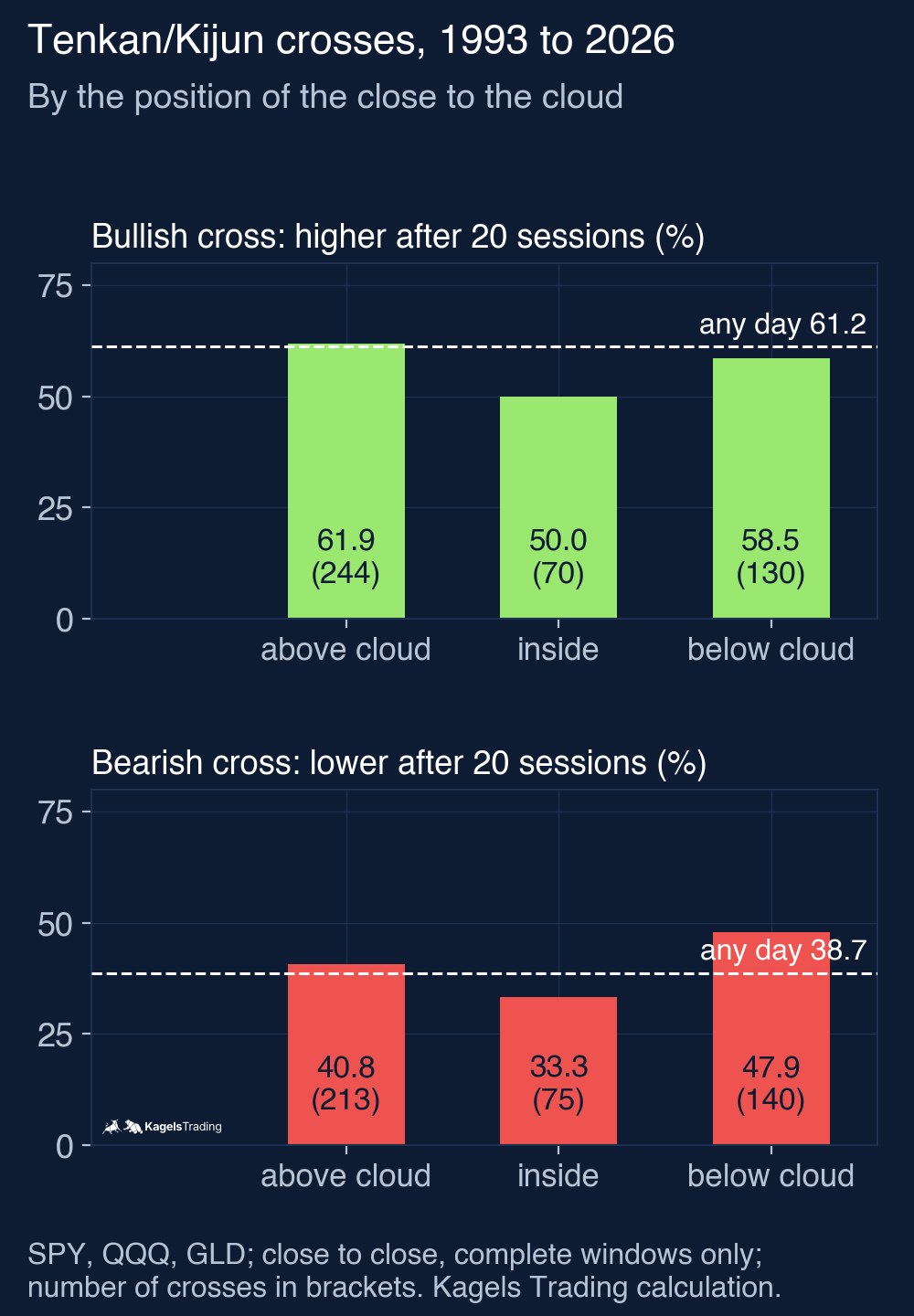
I counted every Tenkan/Kijun cross and sorted it, as planned before calculating, by where the close stood relative to the cloud on that day. For bullish crosses the question is whether the price was higher 20 sessions later; for bearish crosses whether it was lower. The comparison is the share of all days that were higher (61.2%) or lower (38.7%) after 20 sessions.
 Click to enlarge
| Tenkan/Kijun cross, all three ETFs | Above the cloud | Inside the cloud | Below the cloud | All crosses | Any day |
|---|---|---|---|---|---|
| Bullish: higher after 20 sessions | 61.9% (244) | 50.0% (70) | 58.5% (130) | 59.0% (444) | 61.2% |
| Bearish: lower after 20 sessions | 40.8% (213) | 33.3% (75) | 47.9% (140) | 41.8% (428) | 38.7% |
With the close above the cloud, the bullish cross did about as well as any day. It was followed by a higher price in 61.9% of cases, against 61.2% for any day. All bullish crosses together did slightly worse than an average day (59.0%), and crosses inside the cloud did clearly worse (50.0% of 70). In the stock ETFs the market rose so often anyway that a bullish signal had little room to add information.
The bearish side looked more interesting, but not as a short signal. A bearish cross with the close below the cloud was followed by a lower price in 47.9% of cases (67 of 140), against 38.7% for any day. That is a difference of about nine points, but it still means that more than half of these signals were followed by a higher price 20 sessions later. Per ETF the share was 48.0% in SPY and GLD and 47.5% in QQQ; the samples per ETF are small, and the crosses overlap with each other and with the windows of neighbouring days.
The textbook actually sorts crosses by where the cross itself happens, so I added that check after the first results. Here the level of the cross is the base line on the cross day, compared with the cloud on that day. The classification was not part of the plan made before calculating, so read it as a second look at the same crosses, not as an independent test.
| Same crosses, sorted by the cross level | Cross above the cloud | Inside | Cross below the cloud |
|---|---|---|---|
| Bullish: higher after 20 sessions | 56.4% (149) | 57.4% (101) | 61.9% (194) |
| Bearish: lower after 20 sessions | 37.0% (270) | 51.2% (84) | 48.6% (74) |
Sorted this way, the textbook order turned around on the bullish side. The “strong” bullish crosses above the cloud were followed by a higher price in 56.4% of cases, less often than any day (61.2%) and less often than the “weak” ones below the cloud (61.9%). The “strong” bearish crosses below the cloud were followed by a lower price in 48.6% of cases, against 38.7% for any day, similar to the close-based count. In stock ETFs that rise most of the time, crosses after a deep pullback below the cloud were often followed by rebounds.
Finding 3: the cloud as a long-only filter
The most common practical use is simple: stay long while price is above the cloud, step aside when it falls back. I tested exactly that as a hypothetical model: buy at the next open after a close above the cloud, sell at the next open after a close at or below the top of the cloud, 0.05% cost per side, cash earning nothing. The second variant buys only when three things hold at the close: price above the cloud, conversion line above base line, and the close above the close of 25 sessions earlier (the lagging-span condition); it exits like the basic model. Drawdowns are measured on daily closing equity, open positions included. Buy and hold starts on the same day with the same cost and also without dividends.
| Long-only model, % a year (largest drawdown) | SPY | QQQ | GLD |
|---|---|---|---|
| Long above the cloud | 3.4% (−37.2%) | 4.4% (−53.1%) | 5.5% (−41.6%) |
| Variant: hold inside the cloud, exit only below it | 5.4% (−35.9%) | 4.9% (−50.3%) | 6.5% (−40.0%) |
| Variant: also conversion above base and close above the close 25 sessions earlier | 3.2% (−36.5%) | 4.1% (−43.8%) | 5.6% (−40.1%) |
| Buy and hold | 8.9% (−56.5%) | 8.1% (−83.0%) | 10.7% (−45.6%) |
All three versions earned clearly less than buy and hold, with smaller drawdowns. The basic cloud filter was in the market about 51 to 66% of the time and traded often: 222 round trips in SPY, of which only 32.9% were winners. Holding on inside the cloud did better in all three ETFs, because it avoided many small exits. Adding the conversion line and the lagging span as extra conditions did not help: it lowered the return in SPY and QQQ and changed little in GLD. The filter mainly bought protection in the deep declines and paid for it with returns in normal years.
On October 15, 2026, SPY and QQQ closed above the cloud and GLD below it. SPY closed at 771.79, above the cloud top of 766.99; GLD closed at 382.71, below the cloud bottom of 396.51, with the conversion line under the base line. By the textbook that is an uptrend in stocks and a downtrend in gold; by my test numbers it says little about the next month.
These numbers have limits. They come from three ETFs, one setting, daily bars and a 20-session horizon. Ichimoku was designed for Japanese markets and is used on many time frames and in forex, where results may differ. What the test shows is that, on these US ETFs, the two best-known rules did not give a consistent advantage over a random day, and that the cloud as a filter mostly traded return for smaller drawdowns.
How to use the Ichimoku Cloud sensibly
If the cloud describes the recent range rather than the future, use it as a map, not as a trigger. These are ideas for how to use it, not rules I tested beyond the models above.
- As a map of levels: the base line and the edges of the cloud mark the middle of recent ranges. Many traders watch them as support and resistance; the logic is the same as in our guide to support and resistance.
- As a risk filter: if you do not want to hold through deep declines, a rule such as “long only above the cloud” cut the largest drawdown in my test. Know the price: in SPY the return fell from 8.9% to 3.4% a year.
- With a wider exit: in my test, exiting only below the cloud instead of at its top did better in all three ETFs. That fits the general rule that trend filters need room, but it is one result on one sample.
- Not as a stand-alone signal: the Tenkan/Kijun cross, even the “strong” one, showed no reliable advantage over a random day in my test. Combine it with the price chart and size each position by its risk; see our guide to position sizing.
Ichimoku compared with moving averages and the Supertrend
All three describe the trend, but they are built from different things. A moving average averages closing prices. Ichimoku uses the middle of high-low ranges, so a single large close moves it less, but a new high or low moves it at once. The Supertrend builds a stop line from the average true range and knows only two states.
Ichimoku gives more information in one picture, and more room for interpretation. A moving average or a Supertrend gives you one line and one rule. Ichimoku gives you five lines and several rules that can contradict each other: price above the cloud while the conversion line is below the base line, for example. If you like a single clear answer, the simpler tools are easier to follow; if you want levels and context, Ichimoku offers more of them.
Ichimoku in TradingView
TradingView has the indicator built in as “Ichimoku Cloud”. Open “Indicators”, search for “Ichimoku” and choose the built-in entry. Its inputs set the three lengths (9, 26, 52) and the shift (26), and the cloud is drawn ahead of the last bar automatically.
Changing the settings changes every line, so do it on purpose. Some traders adapt the lengths to markets that trade more days a week, such as crypto. My test says nothing for or against such settings; if you change them, check the result on your own market before you trust a signal.
Advantages and disadvantages of the Ichimoku Cloud
The strengths and weaknesses of Ichimoku both come from its richness. It shows a lot at once, and for the same reason it is easy to read what you want into it. The list draws on my test where a number is given; the rest describes how the indicator works.
What speaks for Ichimoku
- Several views in one: trend, levels and momentum without three separate indicators.
- Built from ranges, not closes: the lines react to new highs and lows at once and ignore the order of prices within the range.
- Clear levels: the base line and the cloud edges give concrete prices for stops and support.
- A risk filter in practice: in my test the cloud filter cut the largest drawdown in all three ETFs, for example from 56.5% to 37.2% in SPY.
What speaks against Ichimoku
- Complex: five lines and a time shift take time to learn, and rules can contradict each other.
- The “strong” cross was not stronger: bullish crosses with the cross point above the cloud were followed by a higher price in 56.4% of cases, against 61.2% for any day.
- Above the cloud is the normal state in stocks: SPY closed above it on 66.1% of all days, so the reading adds little.
- Costly as a filter: the long-only cloud model earned 3.4% a year in SPY against 8.9% for buy and hold.
My conclusion: a rich map, not a signal generator
Ichimoku is one of the most complete pictures of the recent price range you can put on a chart. The base line, the conversion line and the cloud give clear levels, and the time shift makes it easy to compare today with a month ago. As a map it is valuable.
As a signal generator it did not convince me. In my test on three US ETFs over their histories, starting in 1993 for SPY, being above the cloud said little about the next 20 sessions, the textbook distinction between strong and weak crosses did not show up on the bullish side, and the cloud as a long-only filter gave up roughly 46 to 62% of the yearly return of buy and hold for smaller drawdowns.
I do not use Ichimoku myself; I read the levels directly from price. If you like the picture, use it to see where the market stands in its recent ranges, and take your entries from the chart itself.
This article is market analysis, not investment advice. Past results of a rule test do not show future results.
Frequently asked questions about the Ichimoku Cloud
What are the five lines of the Ichimoku Cloud?
The conversion line (Tenkan-sen), the base line (Kijun-sen), Leading Span A, Leading Span B and the lagging span (Chikou Span). The first two are range midpoints over 9 and 26 periods, the two leading spans form the cloud and are shifted 26 periods ahead, and the lagging span is the close shifted 26 periods back.
What are the standard Ichimoku settings?
9, 26 and 52, with a shift of 26 periods. These are the usual defaults on charting platforms. A common explanation links them to a six-day trading week in Japan, which I could not verify at a primary source; I tested only the standard settings.
What does it mean when price is above the cloud?
By the usual reading, it means an uptrend. In my test SPY closed above the cloud on 66.1% of all days since November 1993, and across SPY, QQQ and GLD the next 20 sessions were higher on 62.4% of those days, against 61.2% for any day. It describes the recent trend more than it predicts the next month.
How reliable is the Tenkan/Kijun cross?
On its own, not very reliable in my test. Bullish crosses with the cross point above the cloud, the “strong” version, were followed by a higher price after 20 sessions in 56.4% of cases, less often than any day (61.2%). Bearish crosses below the cloud did better than average as a warning (48.6% lower with the cross point below the cloud, against 38.7%), but more than half were still followed by a higher price.
Who invented the Ichimoku Cloud?
The Japanese journalist Goichi Hosoda. According to TradingView he introduced it in the late 1960s; it became widely used outside Japan only decades later, with charting software.
Is Ichimoku good for beginners?
It is not the easiest place to start. Five lines and a time shift take time to learn, and the rules can contradict each other. A single moving average or a channel is easier to follow; if you use Ichimoku, start with the cloud and the base line as levels and add the rest later.
More Technical Indicators guides
- Judge a golden cross
Golden Cross: Definition and S&P 500 Test Results
How the 50-day and 200-day averages cross, and what 38 signals in the S&P 500 since 1950 did against the base rate and buy and hold.
- Judge a death cross
Death Cross: What 38 S&P 500 Signals Since 1950 Show
How deep the S&P 500 fell after 38 death crosses since 1950, how late the signal comes, and what shorting it on SPY did since 1993.
- Use moving averages
Moving Averages: SMA, EMA and a 76-Year 200-Day Test
SMA, EMA and WMA formulas with a worked example, common periods, and what the 200-day line showed on the S&P 500 since 1950.
- Trail a stop with the Supertrend
Supertrend Indicator: Settings, Strategies and an ETF Test
How the ATR-based line is calculated, common settings, five strategies, and what 654 completed flip trades in SPY, QQQ and GLD since 1993 showed.
- Measure trend strength with the ADX
ADX Indicator: What Trend Strength Really Tells You
How +DI, −DI and the ADX are calculated, what 20 and 25 mean, and whether a high ADX meant the trend went on in SPY, QQQ and GLD.
- Read the RSI
RSI Indicator: Formula, Settings and a 75-Year Test
The RSI formula, overbought and oversold, and what RSI signals did on the S&P 500 since 1951 against the base rate.
- Read volatility with Bollinger Bands
Bollinger Bands: Settings, Squeeze and a 76-Year Test
Settings, the three typical chart situations, five strategies with rules, and what the bands and the squeeze showed on the S&P 500 since 1950.
- Set stops with the ATR
ATR Indicator: Average True Range for Stops and Size
True range and Wilder smoothing, stop distance and position size, and how ATR stops behaved on SPY from 1994 to 2026 against a fixed stop.
- Trade Donchian breakouts
Donchian Channel: Breakout Rules and a 20-Year ETF Test
Channel rules, the current-bar pitfall, the Turtle systems, and what 499 breakout trades in SPY, GLD and TLT from 2006 to 2026 showed.
- Read the Stochastic
Stochastic Oscillator: Settings, Signals and a 30-Year Test
The %K and %D formula, what 14, 3, 3 means, fast versus slow, and what 785 oversold signals in SPY, QQQ and GLD did against the base rate.
- Judge a divergence
Divergence Trading: Regular and Hidden Divergence Tested
Regular and hidden, bullish and bearish divergences, when they are confirmed, and what 447 RSI divergences detected in SPY, QQQ and GLD did against the base rate.
- Read the MACD
MACD Indicator: Histogram, Divergence and a 31-Year Test
Formula, histogram, crossovers and divergences, with a 31-year test on the S&P 500 and the DAX against the base rate.
- Use VWAP
VWAP Indicator: Formula, Anchored VWAP and TradingView Setup
The VWAP formula, trend day versus range day, Anchored VWAP and the right settings in TradingView.