The purpose of footprint charts is to allow traders to use the vast amount of data generated by markets in a profitable way. The charts afford greater transparency and provide a visual means to gain deeper insight into trading activity in real time. They significantly enhance information content, which is crucial for traders. In addition to price, they display volume and order flow.
Inhaltsverzeichnis
History
Footprint charts were developed at the CME in 2002 and have been available to the public since 2003.
They are thus a relatively new way of presenting information and are the only type of chart to be developed after electronic trading was introduced and trading moved from the floor to the screen.
They made it possible for the first time to combine and visualize all the available market data.
Just as the introduction of the DOM significantly accelerated order entry for most traders, so too did footprint charts bring similar added value to charting.
What are footprints?
They are a type of chart that allows you to look into the market.
You receive three layers of information at each data point:
- Price (each cell in a footprint represents a price or a series of prices).
- Volume (displayed as numbers in the cells)
- Order flow (expressed in colors, depending on the footprint type)
This data is summarized logically, allowing you to look under the hood of the chart.
In the figure, you see a candlestick and a footprint bar. The left-hand column in the footprint bar shows the bid volume, and the right-hand column, the ask volume.
Whereas a normal chart only shows price, the footprint additionally displays volume and order flow.
As a result, footprints offer many advantages:
- You are closer to the action and get insight into the chart.
- You can gauge the emotions in the market.
- You have greater confidence in trading because you better understand the market.
- You get a real-time, undistorted view.
- You gain insight into the “energy” necessary to move the price.
- You can see how volume develops not only horizontally but vertically (i.e. not only bar by bar but also price by price).
- You can identify price and volume patterns not visible on a normal chart.
- You can see how buy and sell orders impact price.
- You can more effectively assess whether the market will continue its trend.
- You have an information edge over most other traders who look only at the open, high, low and close.
The most common types of footprint charts
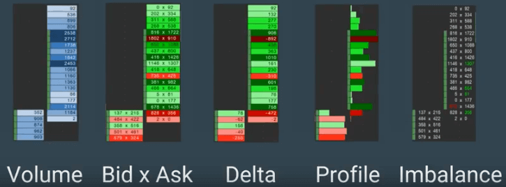
- Volume footprint
- Bid x ask footprint
- Delta footprint
- Profile footprint
- Imbalance footprint
Volume footprint
The only data displayed by the volume footprint is the total volume traded at each price, regardless of whether it was at the bid or at the ask. It’s useful in detecting high volume during trading.
The formula is as follows:
Bid-traded volume + ask-traded volume = volume footprint.
For example:
700 + 350 = 1,050
You’ll never see a negative number here because the figure is the sum of the traded volume at each price. The darker the color, the higher the volume.
Bid x ask footprint
This type of footprint shows the number of shares or contracts traded at the bid and ask at a certain price.
The elements displayed are as follows:
Bid-traded volume x ask-traded volume (e.g. 700 x 350)
Please note that the “x” is not the mathematical multiplication sign, but a separator.
The bid x ask footprint provides shows how much volume is traded at a given price and whether more buyers or sellers are responsible. It allows you to see changes in momentum and order flow. If the background color is green, the buyers were more aggressive. If it’s red, the sellers dominated. The darker the color, the more aggressive the respective market participants.
Delta footprint
The delta footprint displays positive or negative values.
A negative delta indicates aggressive selling and a larger number of sales at the bid. If the delta is positive, it’s a sign of more aggressive behavior by buyers, who purchased at the ask.
The delta is calculated as follows:
Ask-traded volume – bid-traded volume = delta
For example: 350 – 750 = –350
In this example, the delta is –350, which shows that selling pressure was greater at the price in question. Or, to put it another way, 350 more contracts were traded at the bid than at the ask.
This allows you to measure buying and selling pressure at a given price and determine who is being more aggressive, the buyers or the sellers. The darker the color, the more aggressive the market participants.
Profile footprint
This type of footprint is somewhat similar to the Market Profile.
It displays a profile, or histogram, of volume. The color of each profile reflects the delta. Green stands for a positive delta (buying pressure) and red for a negative delta (selling pressure). The darker the color, the greater the delta.
So you receive the delta in addition to the normal volume distribution. As a result, you can see how much volume was traded and how this volume emerged.
Imbalance footprint
The imbalance footprint has only been around since 2013.
We’ve discussed four types of footprint charts so far, and in each one, the delta or volume at a given price determines the chart’s color. In order to calculate the delta, the volume traded at the bid is subtracted from the volume traded at the ask. This gives you an idea of the order flow at a given price.
What distinguishes the imbalance footprint is that it compares bid-traded volume at a given price to ask-traded volume at the next higher price level. An algorithm shows the ratio of the volumes at the two levels.
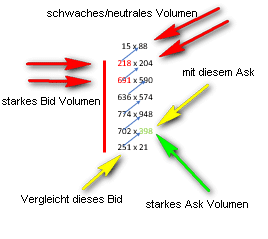
The goal of this footprint is to automatically detect imbalances by constantly comparing the bid price with the next higher ask price. The automatic color-marking of the numbers is configurable, like all the colors in footprint charts. It is determined by a percentage value specifying how much greater one volume must be than the compared volume.
The default setting is 140 percent. In the example below, “398” is marked in green because the value of 398 is greater than 251 x 140 percent, or 351. It indicates a high ask volume and a significant imbalance. When the values are marked in red (indicating high bid volume), it’s the other way around.

Providers of footprint charts
The best-known providers are:
Use of footprint charts
Thanks to the variety of footprint charts, a large number of applications and strategies are possible.
Footprint charts can be used in all markets and time frames. Scalpers prefer smaller time frames, while longer-term traders work with larger time frames.
Trend phases with dark colored footprints
When the market is trending upward or downward, you should see dark green or dark red footprints. The dark footprints should fill most of the bar. A good indication of a strong trend is when the price at the top or bottom of the bar is a dark color (green for an uptrend and red for a downtrend). The sooner the dark color appears, the better. Colors growing lighter are a sign that a trend is quickly coming to an end and momentum is declining. If, in addition, the opposite color appears, it is an even stronger indication that the trend is ending, at least temporarily.
Range phases
In range phases (consolidations / sideways movements), the colors should alternate. The ideal balance of colors should be 50 percent red and 50 percent green. At any rate, all the bars shouldn’t be the same color. This phenomenon can usually be observed at midday or in “value areas.” Often, dark green bars appear at the high, and dark red bars at the low, suggesting that some traders were speculating on a breakout and were wrong. A breakout may occur, but even in that case it’s usually better to bet on a retreat from the extremes of the range. It’s also helpful to look at the delta footprint chart, particularly at the deltas at the high and low of each bar. Volume often declines at these extreme points, and since breakouts don’t usually occur on low volume, such readings are another sign of a possible failure of the breakout. You can thus see evidence of an impending reversal within a range.
Bar delta
The bar delta is defined as the sum of all footprint deltas in a given bar and can be used in several ways. One strategy is to see it as confirming price movement. When price moves up, the bar delta should be positive. Normally this confirms that aggressive buyers are supporting the price and the trend will continue. In a downtrend, the opposite is true. Aggressive sellers generate a negative delta, which usually signals falling prices. In range phases, by contrast, positive and negative deltas should alternate. If, in a range phase, the delta of the bars is predominantly green, it can be a sign that the market will break out of the range to the upside.
Basic rules for interpreting price, volume and delta
Volume should increase when prices move in the direction of the trend. It should decrease in the opposite direction of the trend.
The delta, which represents the net buying or selling pressure at each price, is highlighted in color. It should be positive and increase in an uptrend and negative and increase in a downtrend.
| Price | Volume | Delta | Market |
| Rising | Increasing | Rising / positive | Strong and moving up |
| Rising | Decreasing | Decreasing / positive or becoming negative | Weak |
| Falling | Increasing | Increasing / negative | Weak and falling |
| Falling | Decreasing | Decreasing / negative or becoming positive | Strong |
Practical examples
The S&P e-mini futures as an example
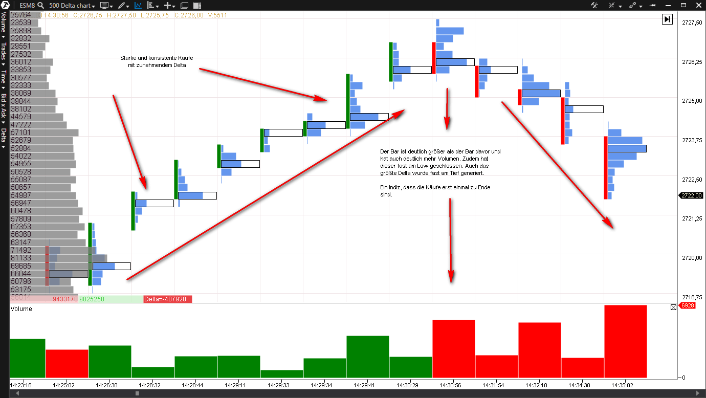
The increasing delta shows consistently strong purchases. They are followed by a candle with a negative delta and significantly higher volume than the previous candle. This candle closes almost at the low, and the highest delta was also reached near the low. This is an indication that buying pressure is temporarily over.

An example of the use of footprint charts to trade the S&P e-mini futures on the ATAS platform.
Forex trading as an example
Footprint charts can generally be used for all exchange-traded instruments. Futures markets are the most important application area.
However, they can also be used for the forex market, even though there is no volume data, making it impossible to analyze volume with the usual tools. (This is the result of forex being an over-the-counter market.)
If someone purchases, say, five contracts in the futures market, it registers as a volume of five in the order book of the respective exchange. In the forex market, though, volume can’t be displayed by the number of contracts purchased. Instead, it is measured by adding up all the price changes recorded during a specified time.
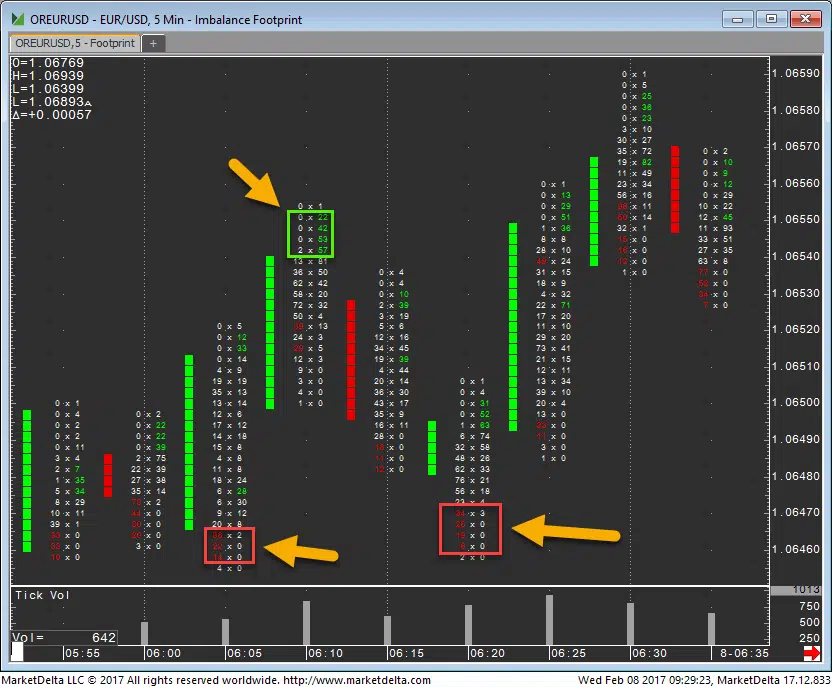
The above screenshot shows an imbalance footprint chart. Three or more imbalances that occur at the high or low sometimes signal a short-term exhaustion and a pullback. You can use this information to enter or exit a trade.
It is only an indication, but together with other technical analysis tools, it can help you identify potential entries and exits.
Conclusion
Footprint charts offer an important advantage over classical charts. In addition to price, they display volume and order flow.
Data display is well structured and logical, making it possible to use the information on volume and order flow without having to look at the order book.
There is a wide variety of footprint charts, and you can adjust them to reflect personal preferences and trading approaches.
Nonetheless, as with any other tool, there are limits to footprint charting. Like pure order book trading or technical analysis, they aren’t the holy grail. The use of footprint charts alone will not give you a statistical edge, but if they are used properly, they can earn you money.
In my opinion, volume and order flow are important factors (especially for day trading), and footprint charts are an excellent tool for analyzing them.
Read more


